Figma

FinTech
Product Designer
100+
Components
70+
User Flows
18+
Features
10000+
Happy users
Components
User Flows
Features
Happy users
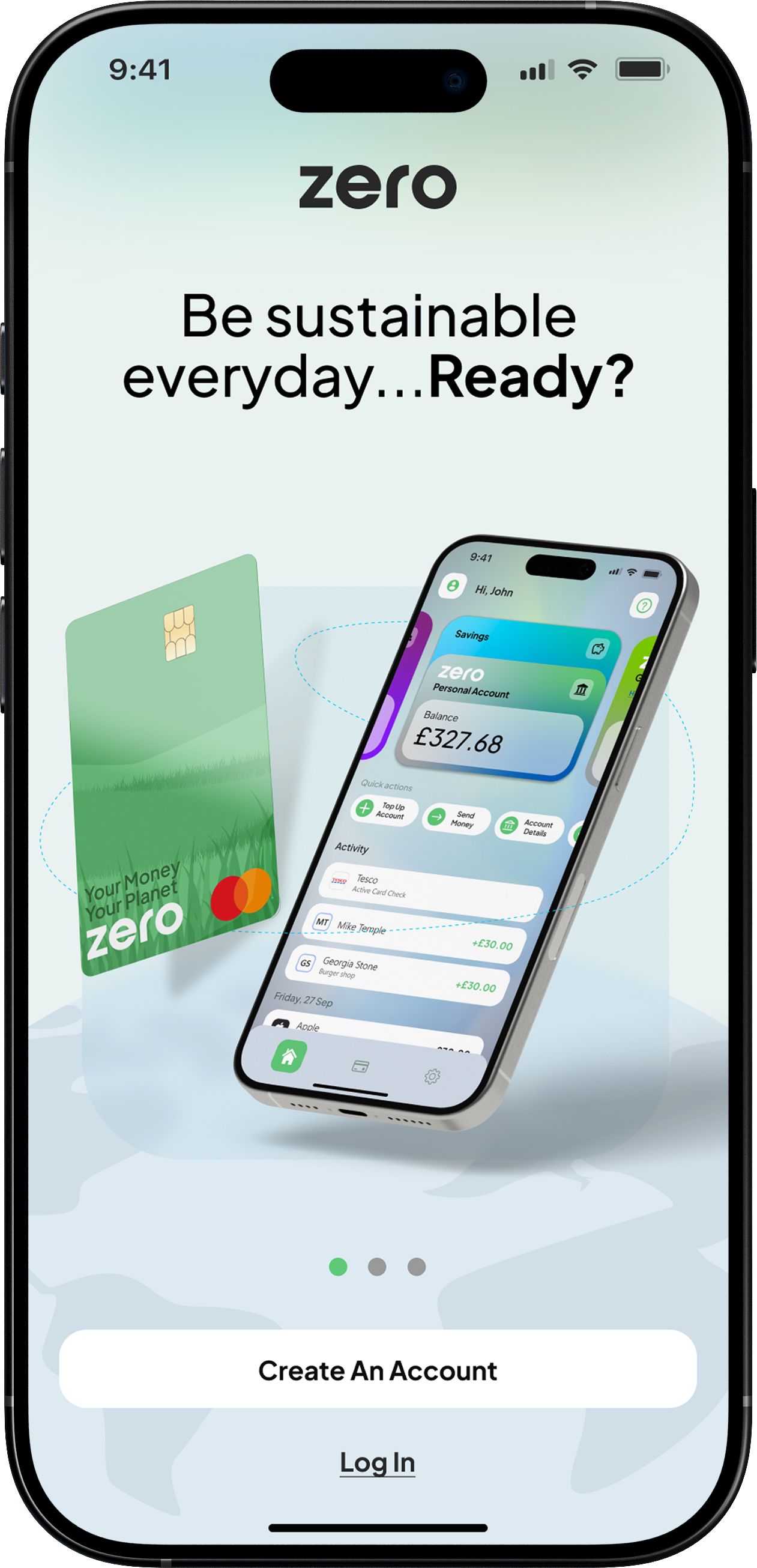
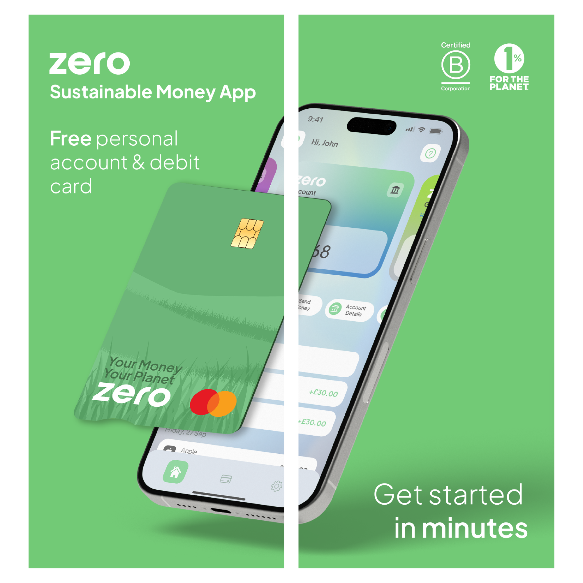
At Zero, I was the first product designer, leading the end-to-end design of a brand-new digital banking experience. I built the product from the ground up, creating the design system, mapping complete user journeys, designing the website, and ensuring every touchpoint, from onboarding to physical debit cards, was coherent, usable, and aligned with the brand. My work balanced strategic thinking, user-centered design, and practical execution, delivering a product that felt trustworthy, simple, and scalable.
From research to production, I mapped and simplified a complex journeys, including onboarding, account sign-up, first transactions, and savings account setup. This created a seamless first-time experience that reduced friction, improved user confidence, and guided users through critical early steps with clarity.
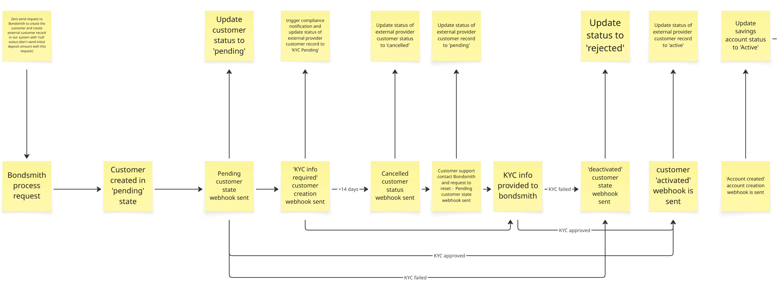
I mapped a detailed end-to-end journey across customer states, covering KYC, account creation, and activation flows. Informed by competitor analysis and fintech research, I reduced unnecessary steps and structured the experience to be more seamless than existing solutions, allowing users to progress with clarity and minimal friction.
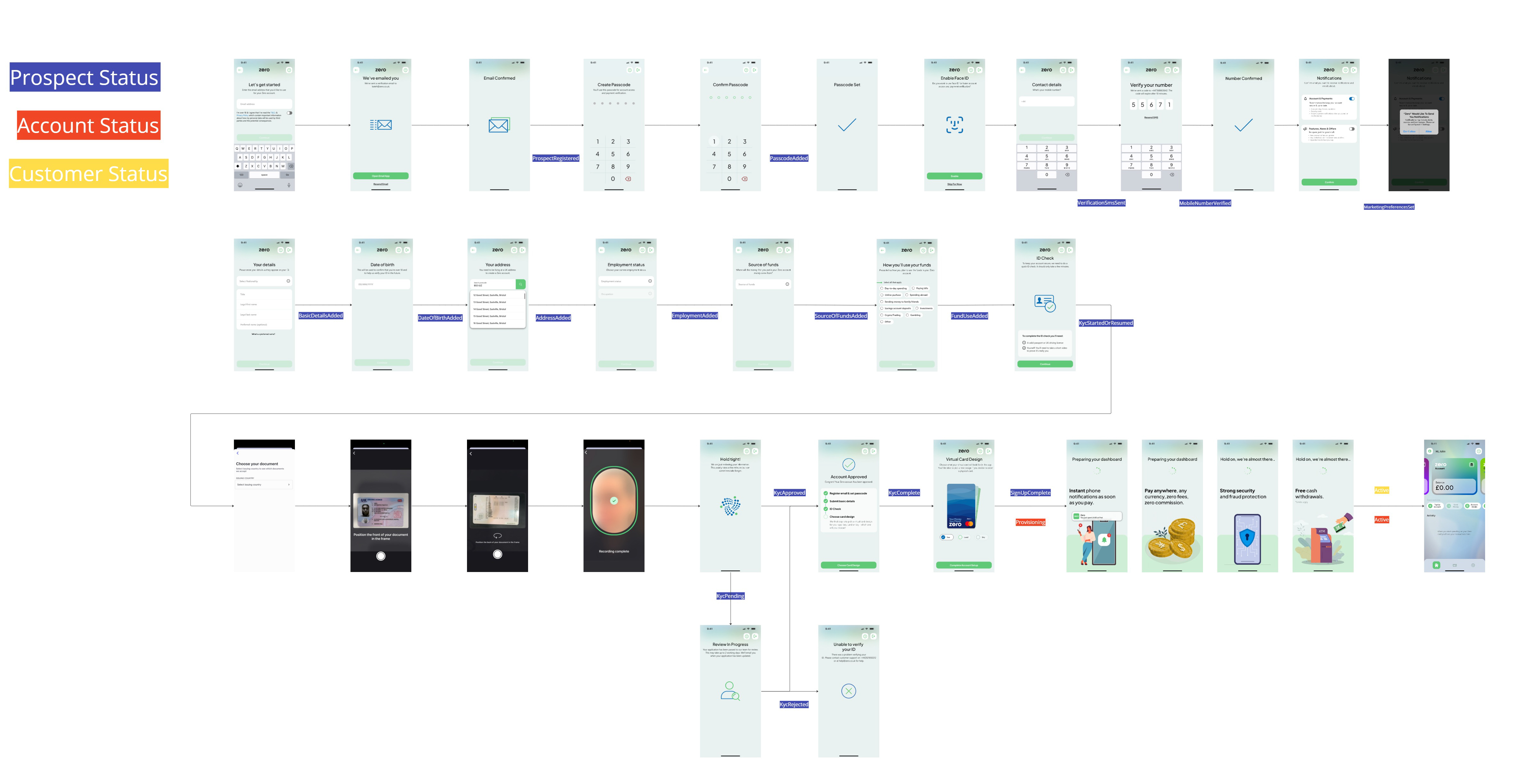
In more complex scenarios, a linear journey was not enough. Interactions involving KYC, external providers, and changing customer states required mapping multiple outcomes rather than a single path. This reinforced that product design is not always clear cut, requiring adaptability to real-world constraints while still delivering a clear and consistent user experience.
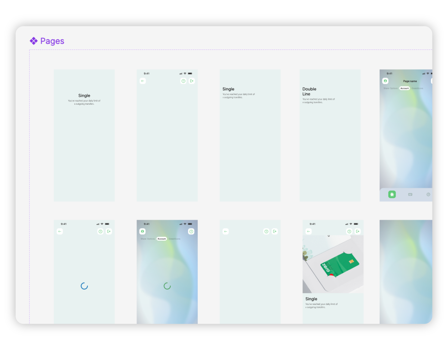
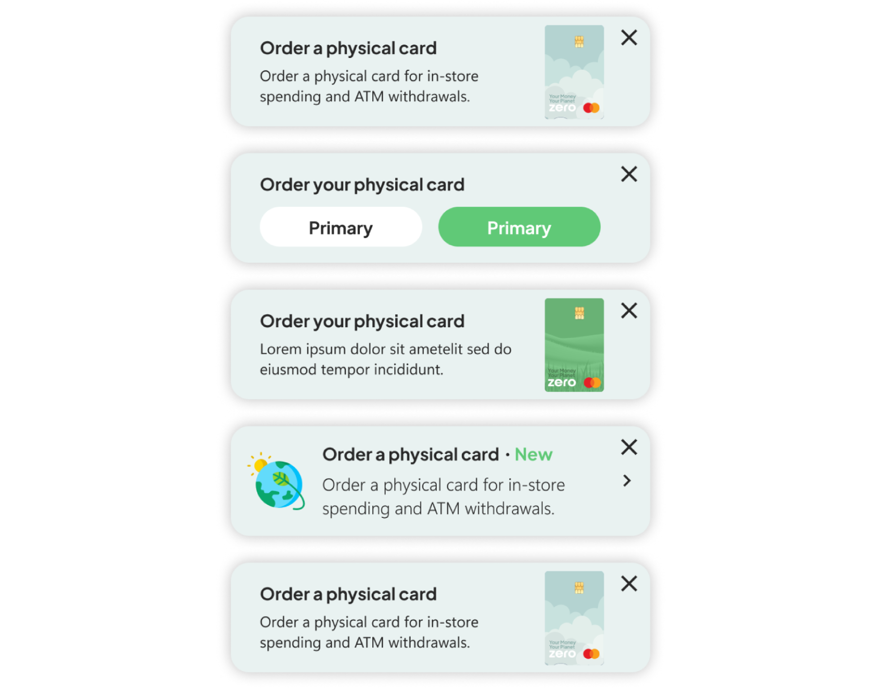
I moved from low to high fidelity to take ideas from rough concepts through to production. Wireframes let me quickly map out flows and structure, while high fidelity designs refined the detail, interactions, and usability. This kept things moving fast early on, while making sure the final experience was solid and ready to build.
Wireframe
Low fidelity
High fidelity
I used Figma prototypes to test flows and interactions, helping identify friction early and refine the experience before development. These prototypes were also used to align stakeholders and support early funding discussions.
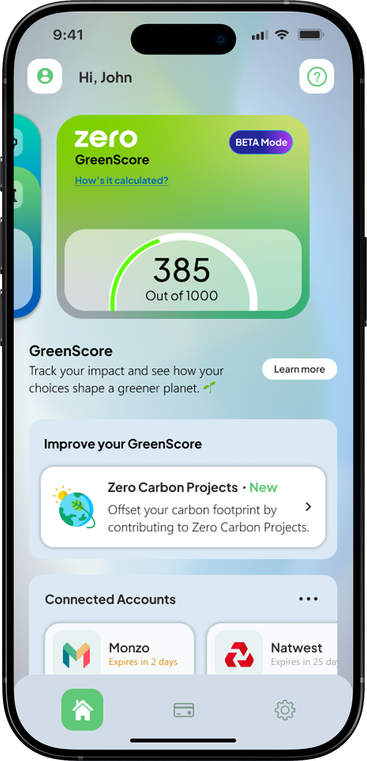
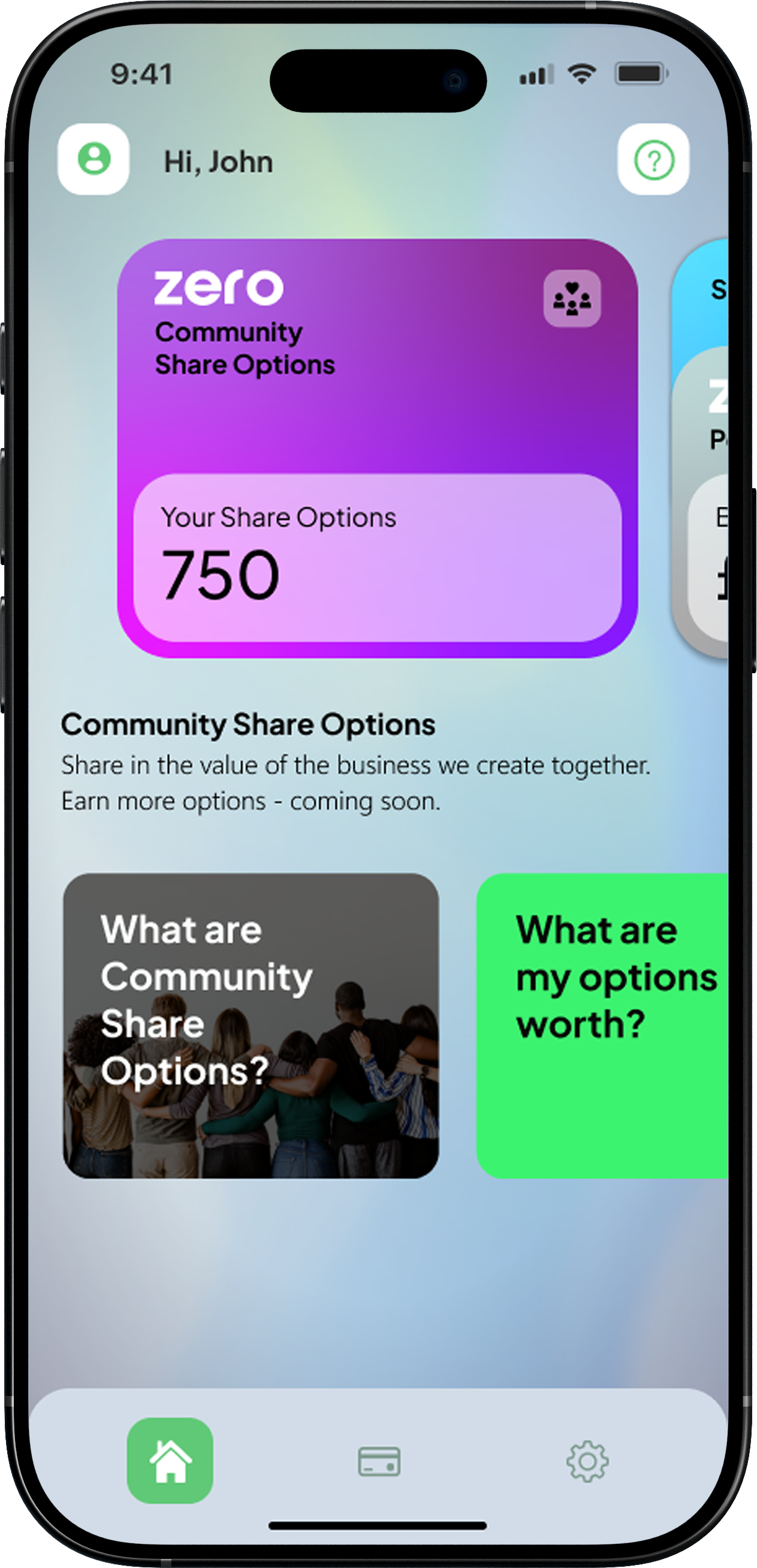
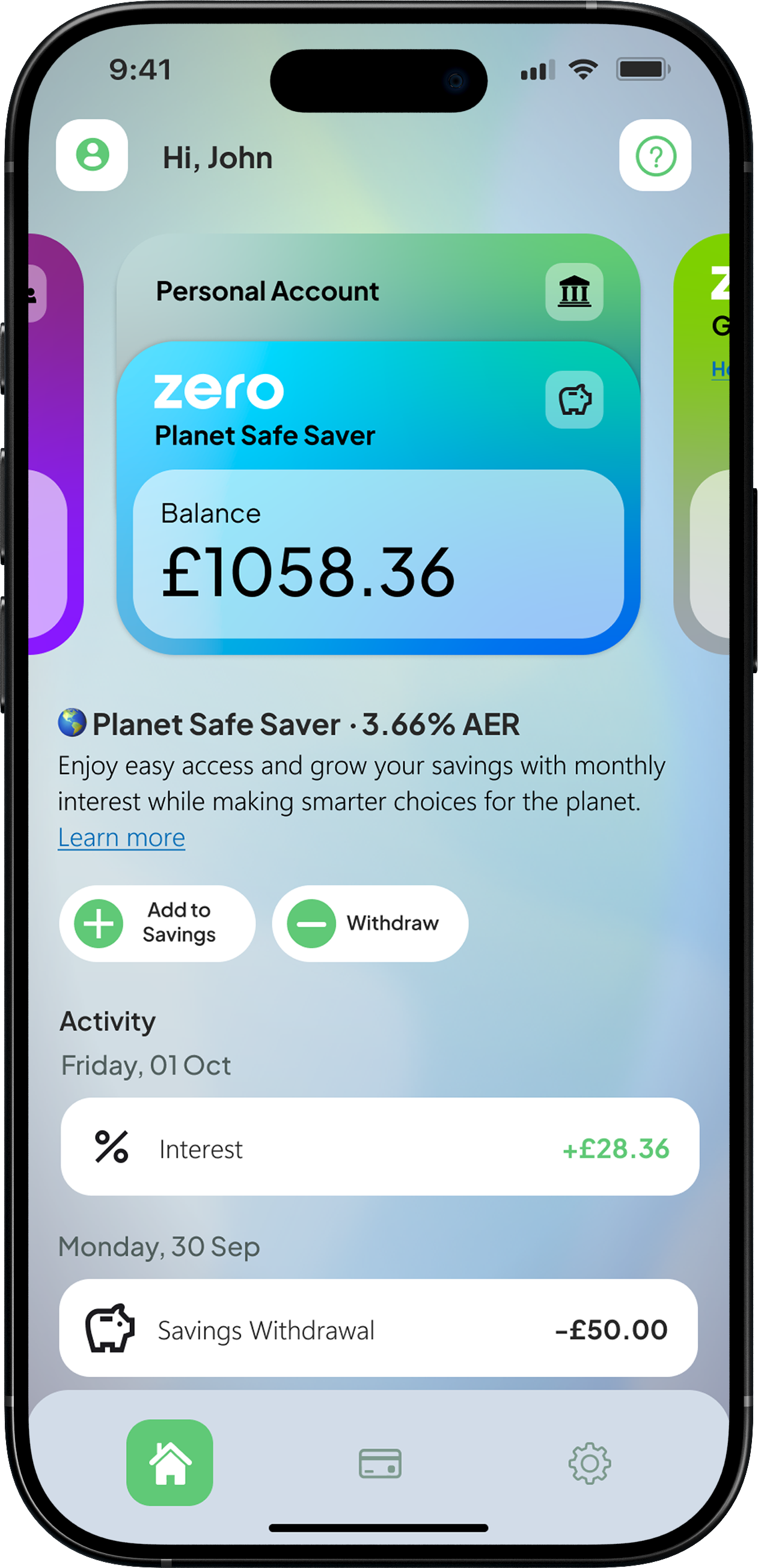
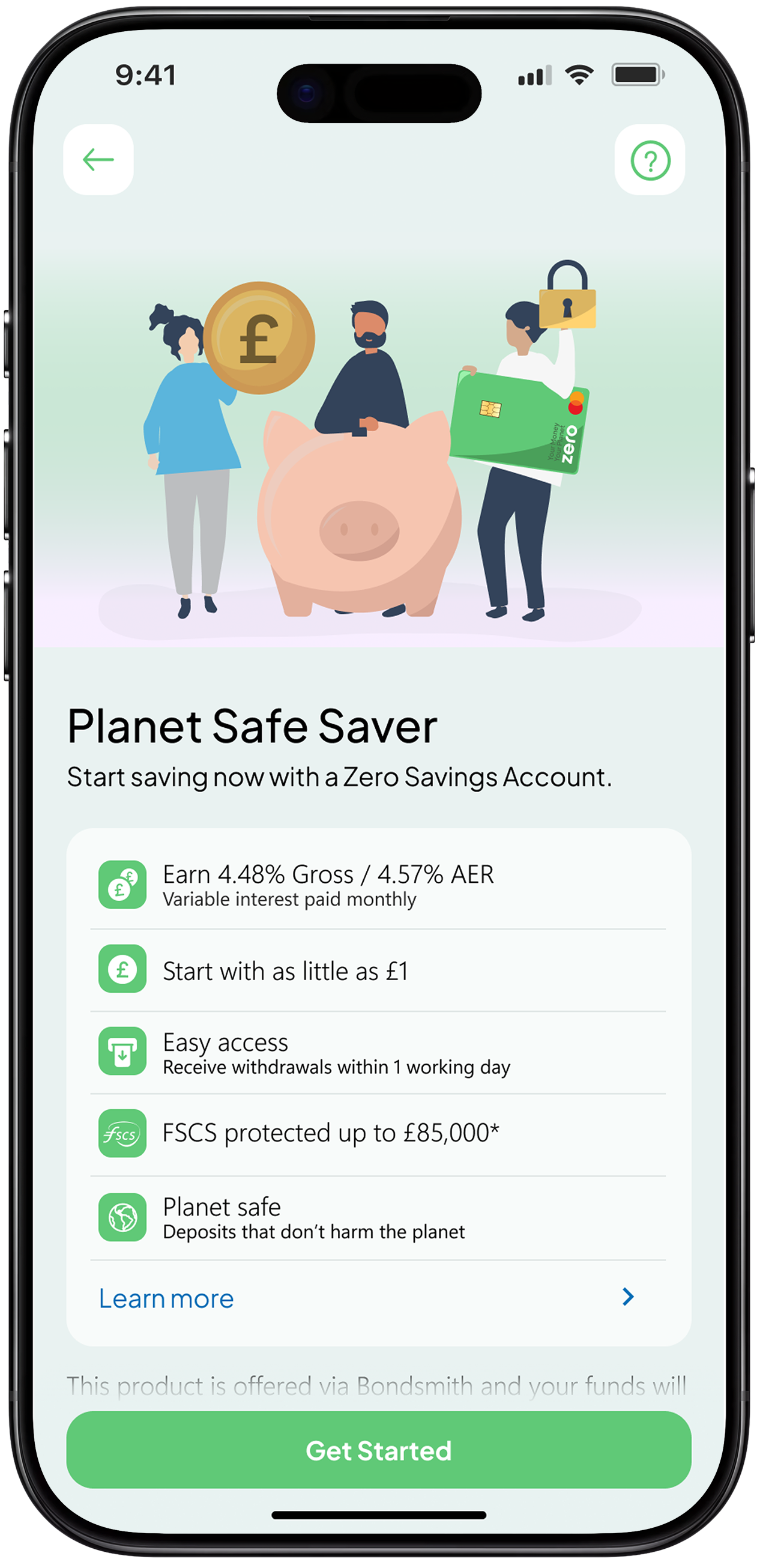
I focused on shaping a core experience that feels simple and easy to trust. I translated complex financial journeys into clear, guided steps, helping users set up accounts, complete key actions, and start saving with minimal friction.
I mapped the full end to end journey across different customer states and refined the flows using research and competitor insights. By removing unnecessary steps and simplifying processes like KYC and account setup, the experience feels smooth, familiar, and easy to navigate from the start.
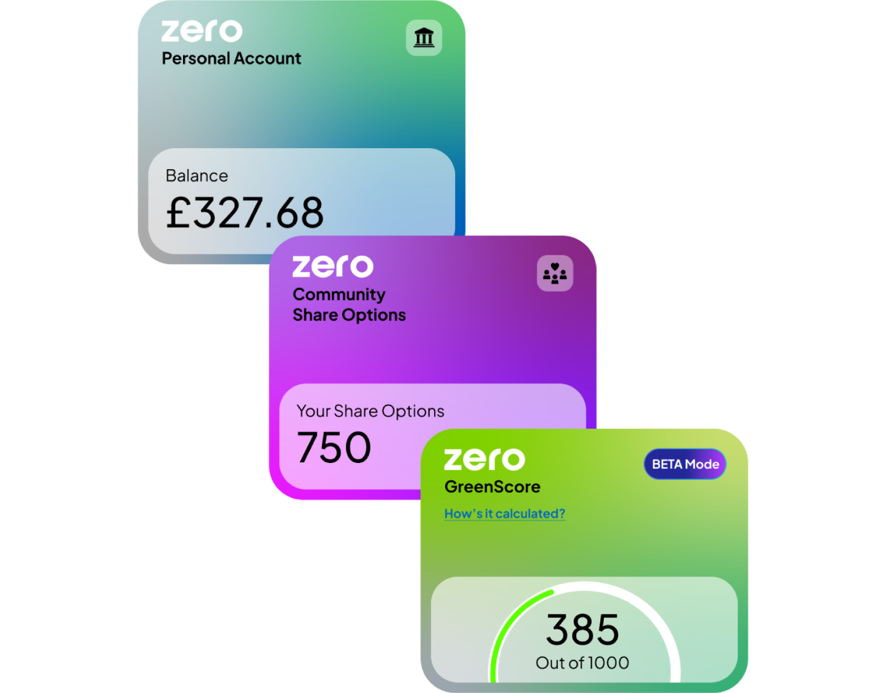
Dashboard
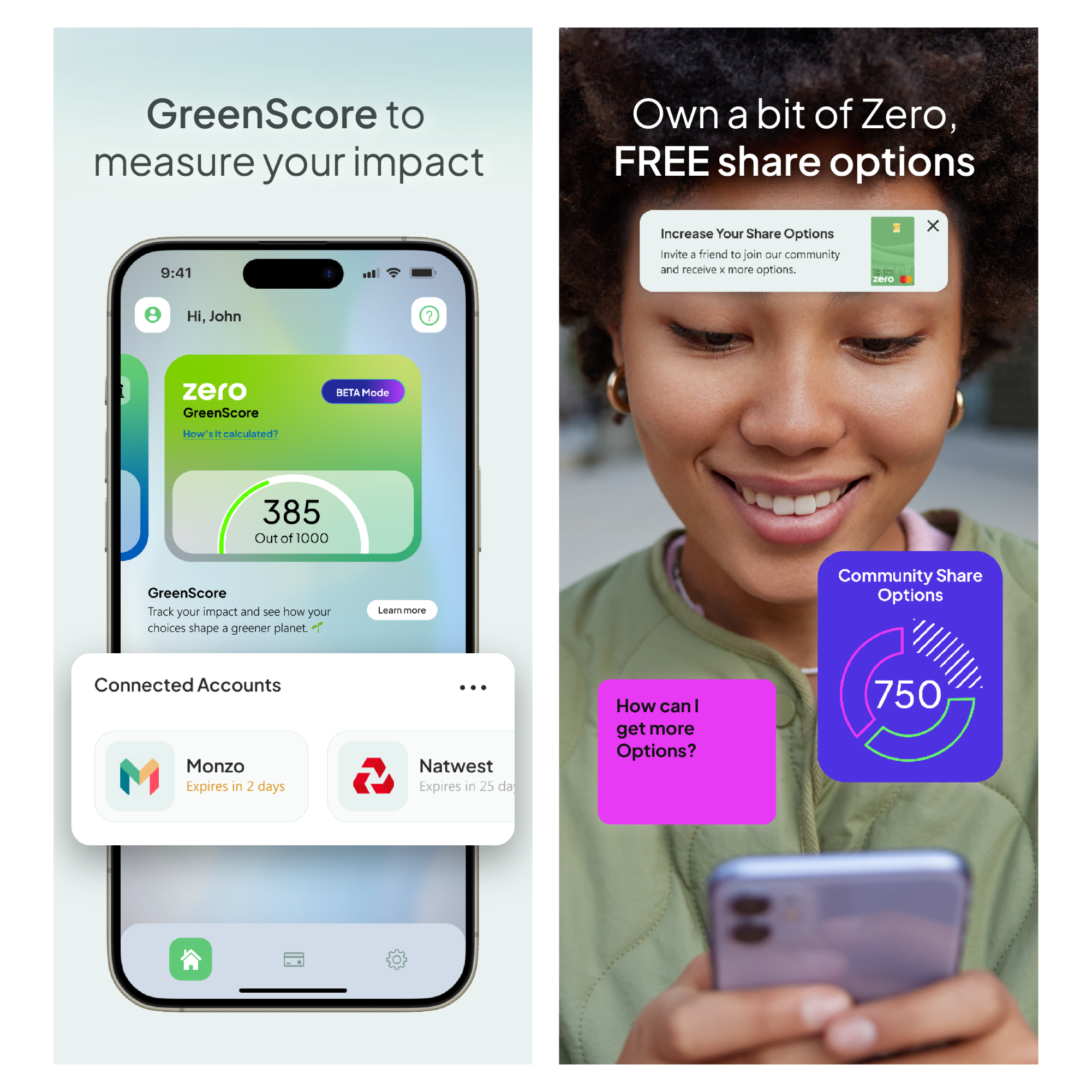
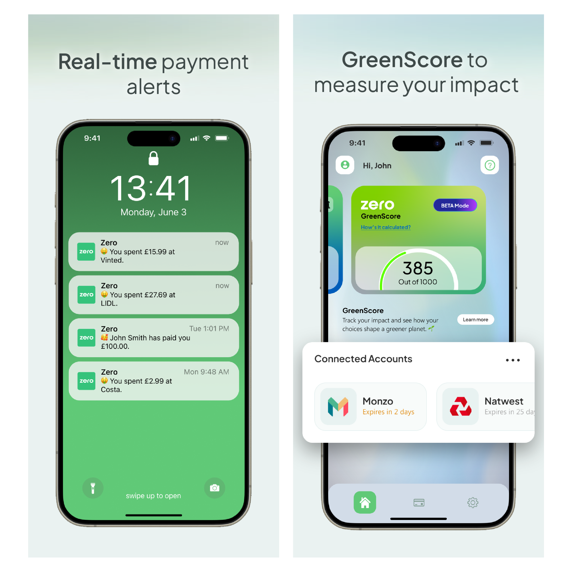
GreenScore
Community options
Carbon offsetting
Savings
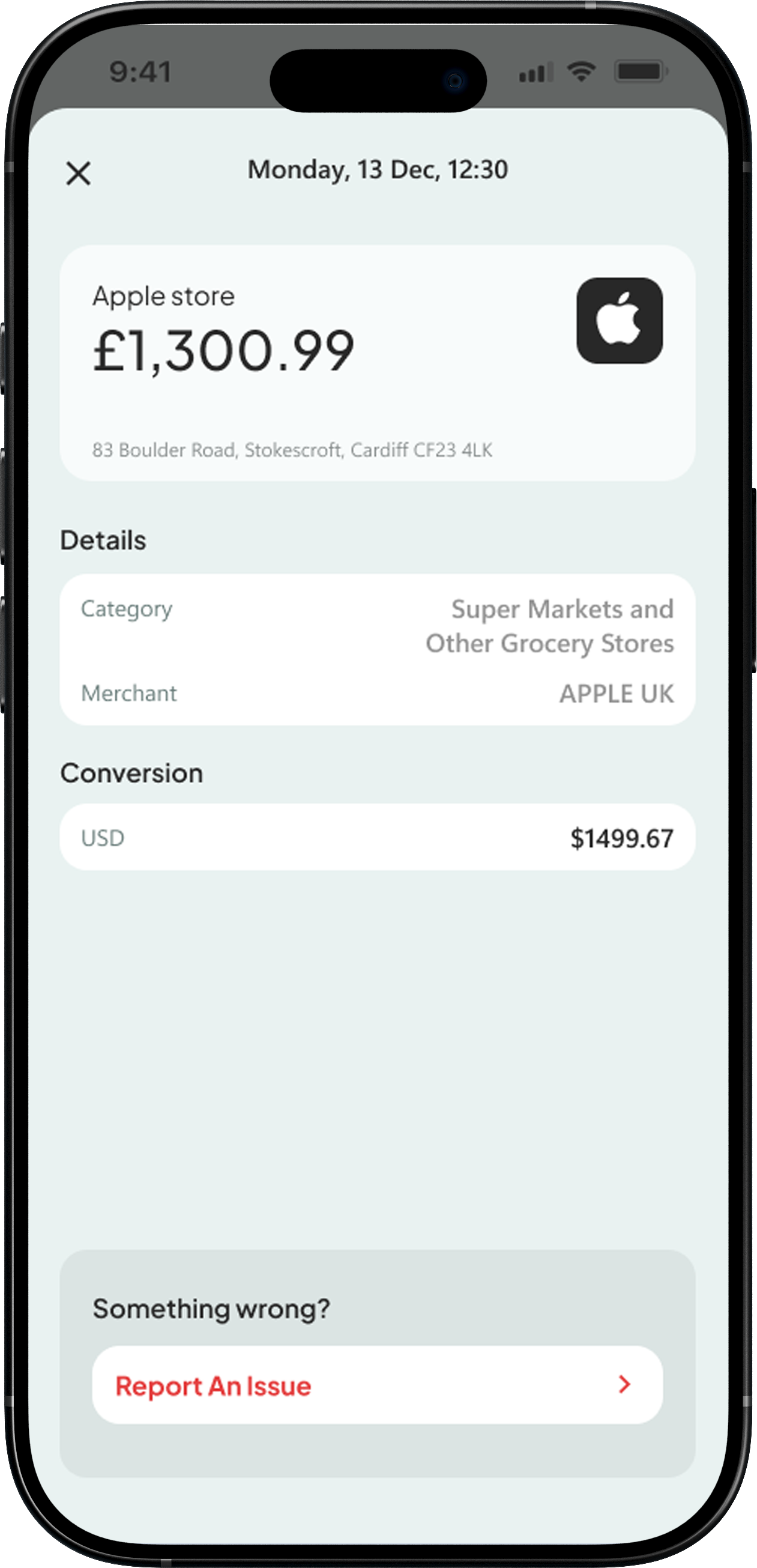
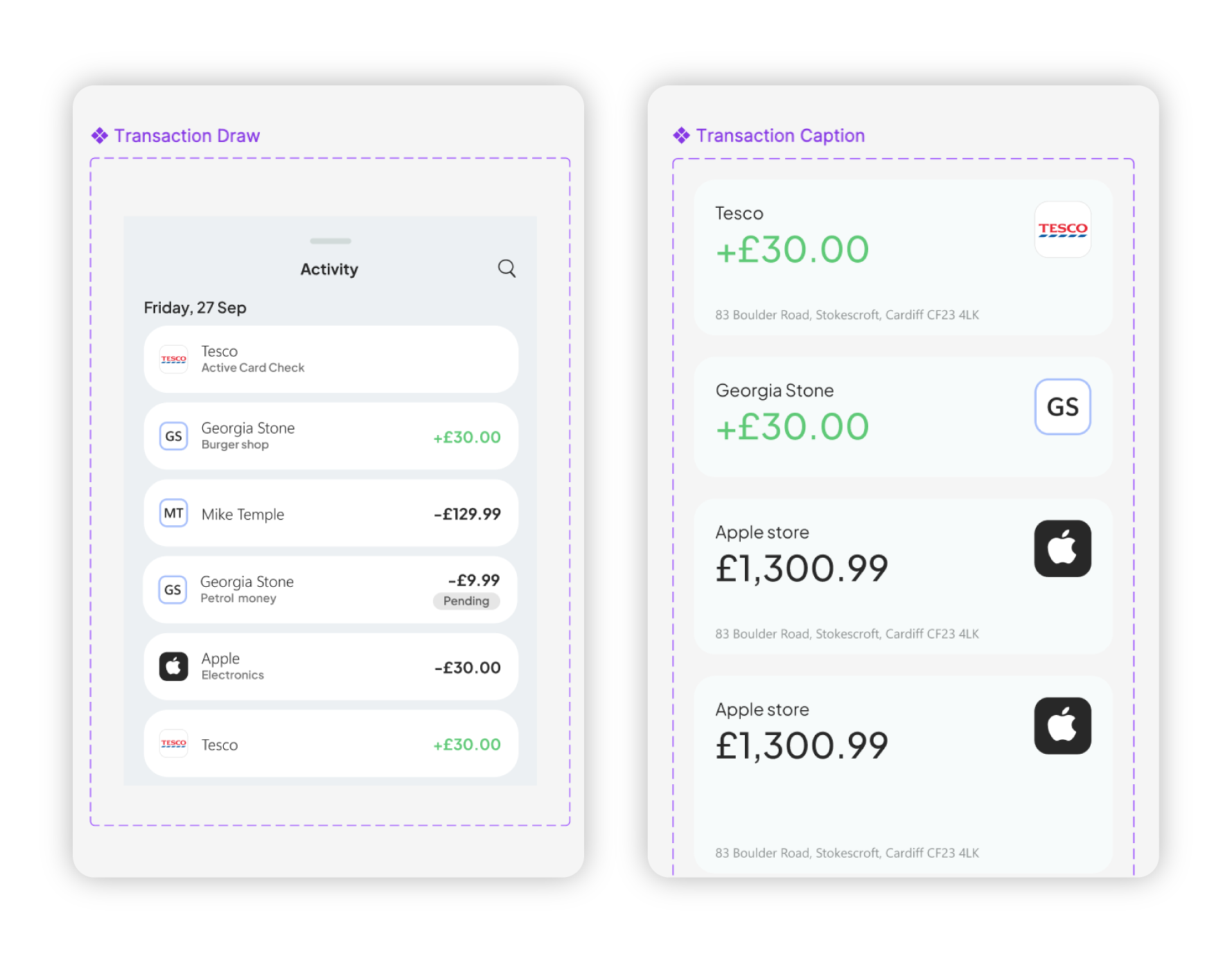
Transaction
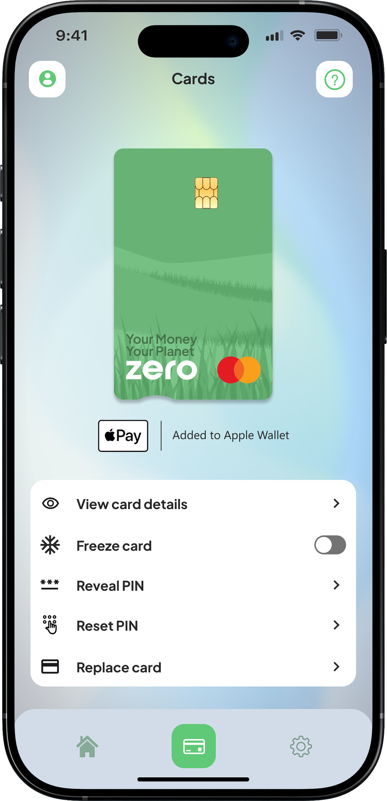
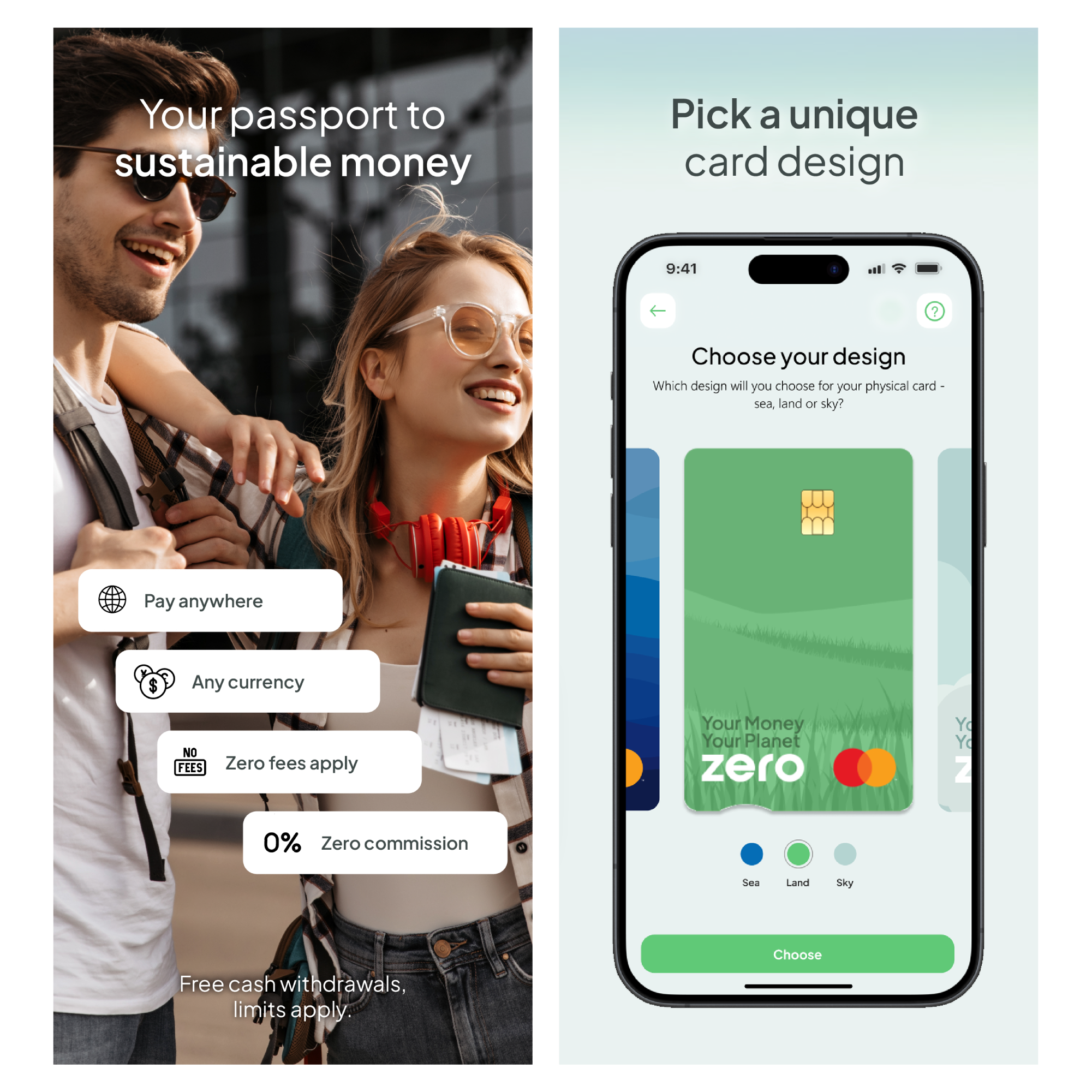
Card
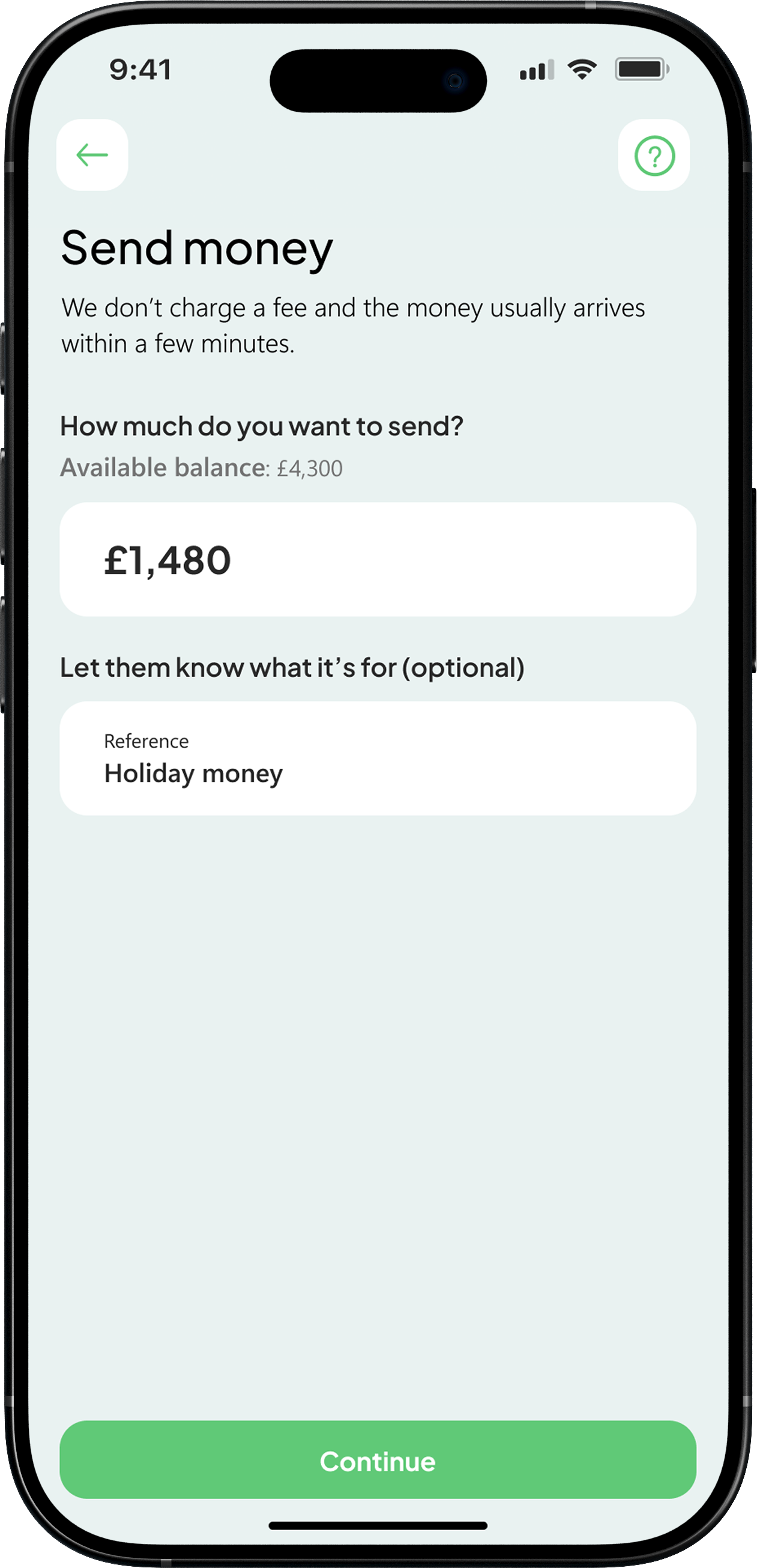
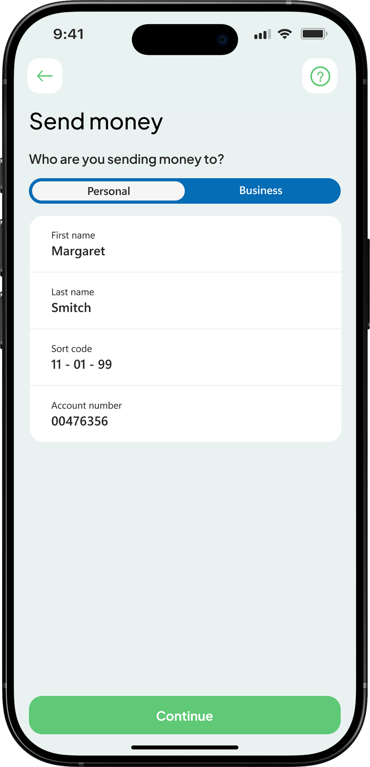
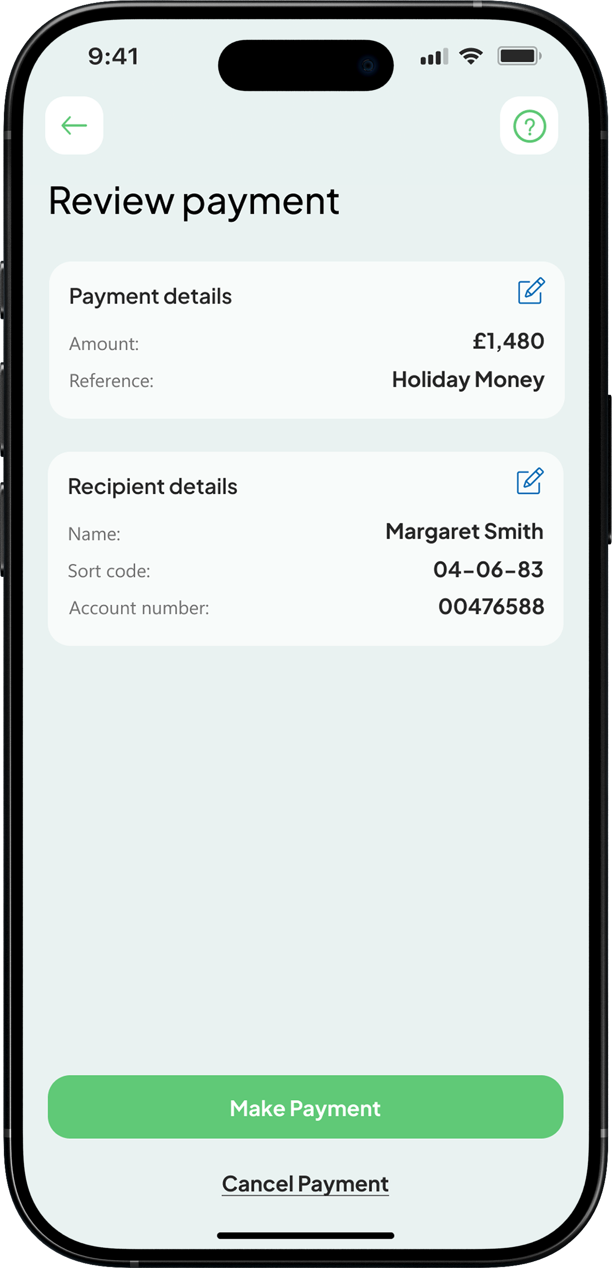
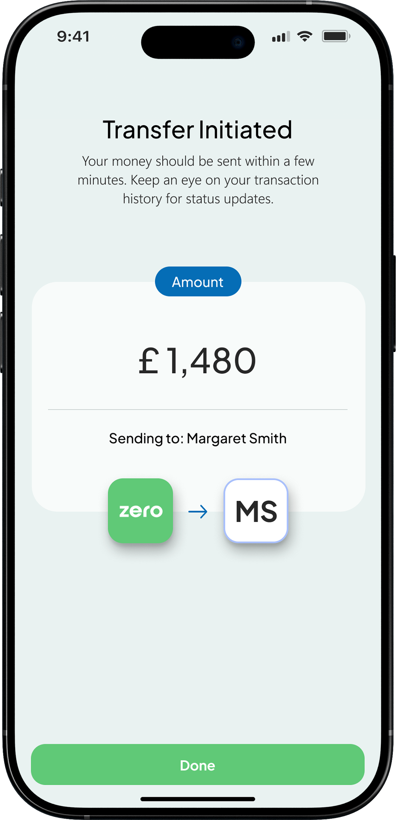
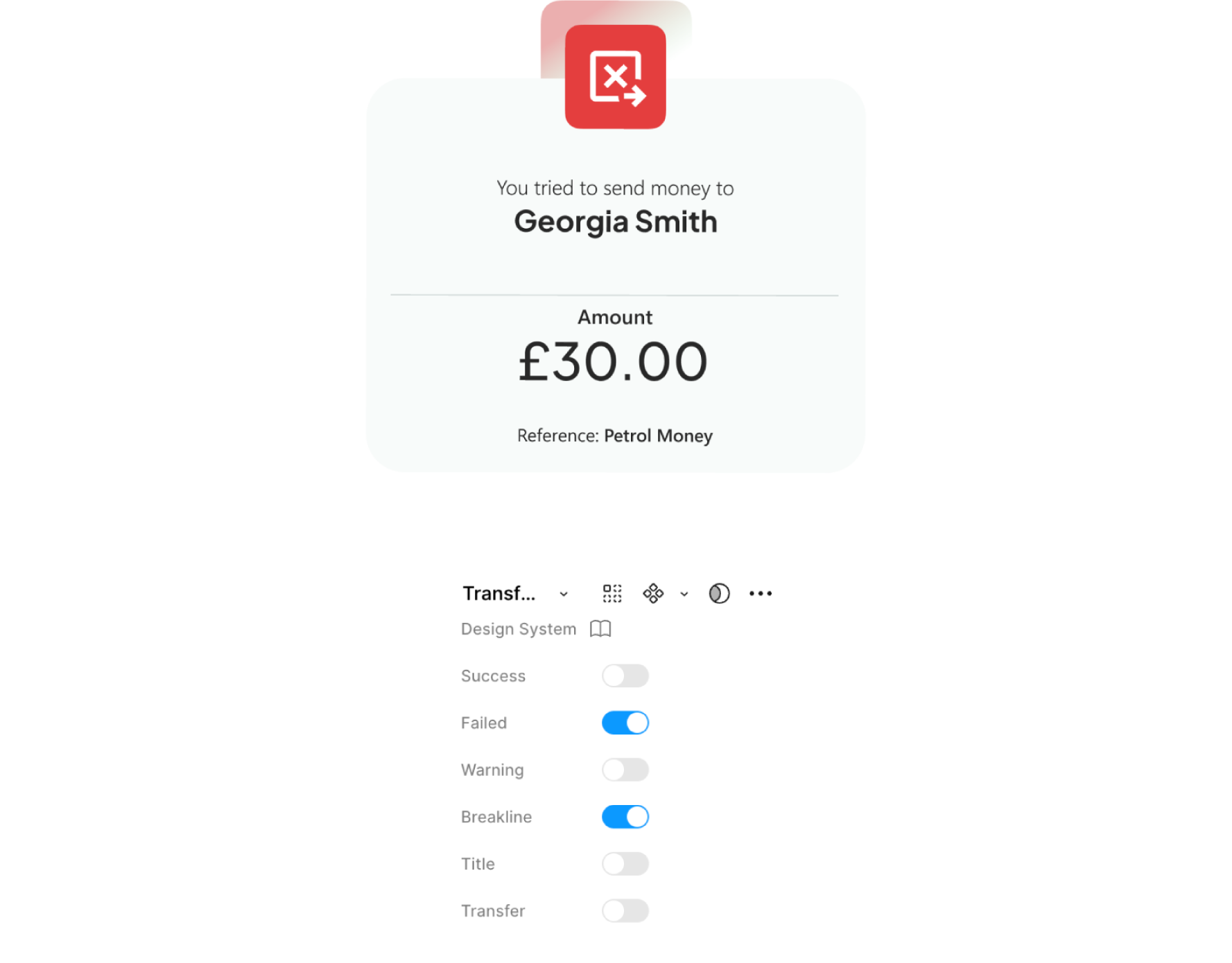
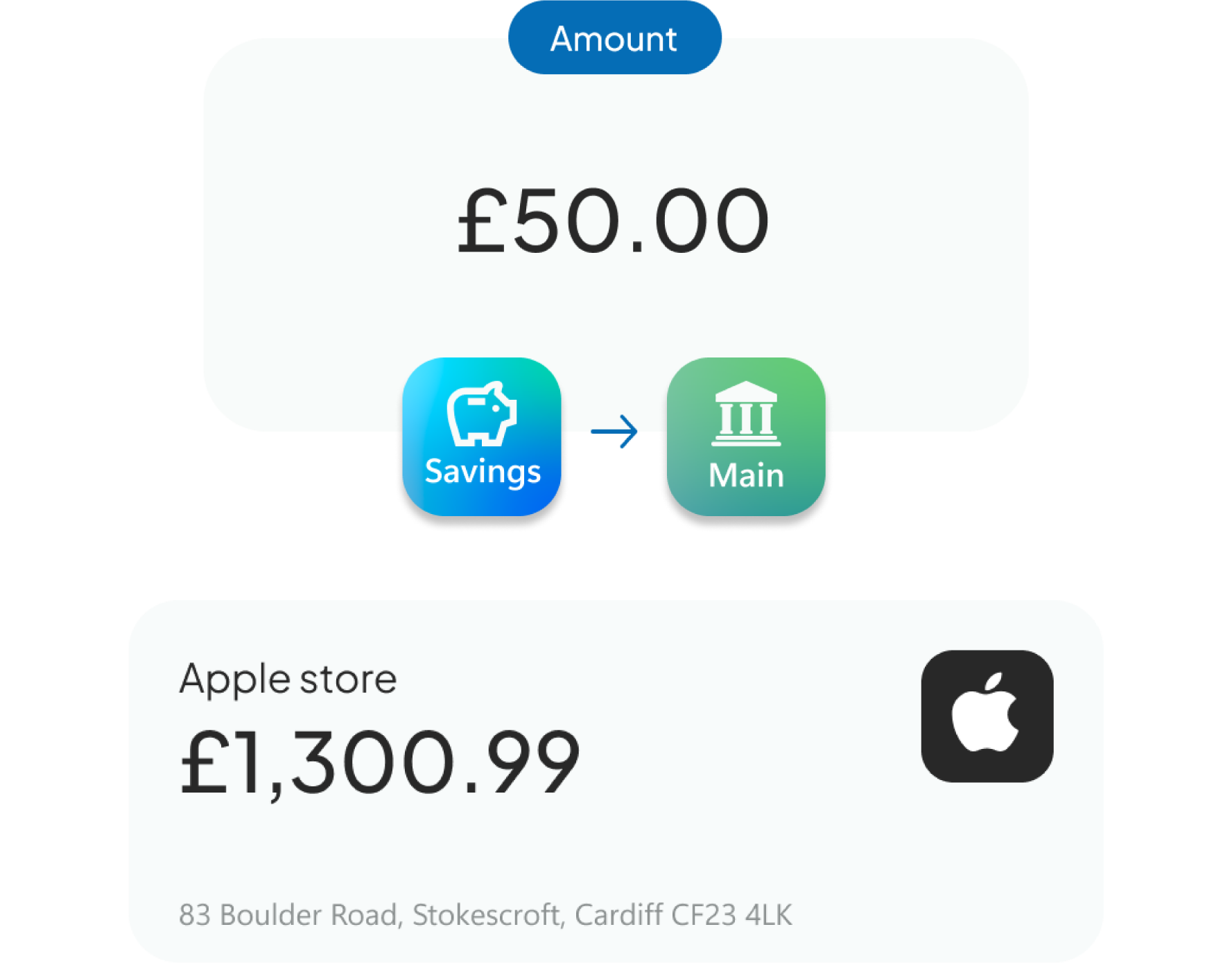
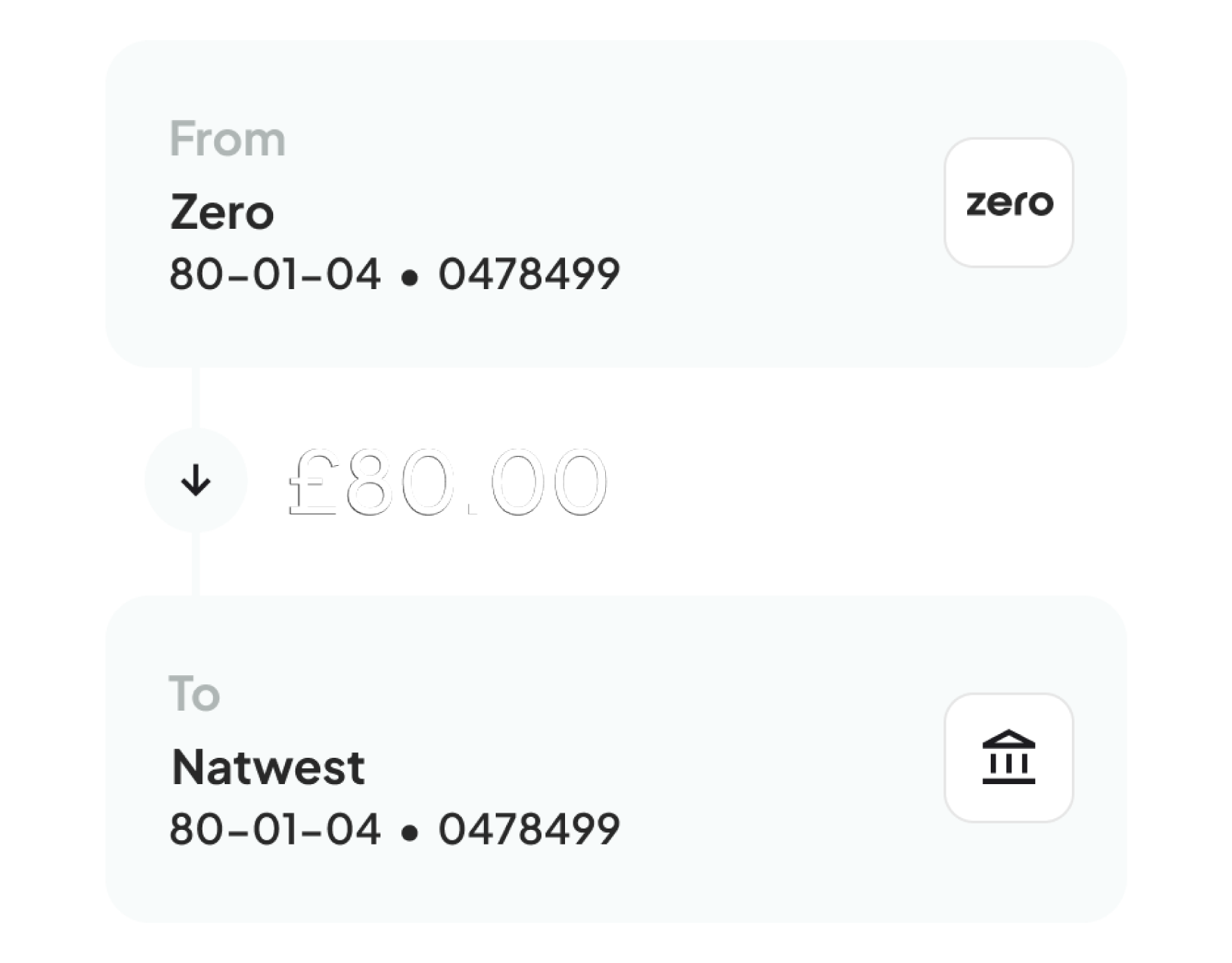
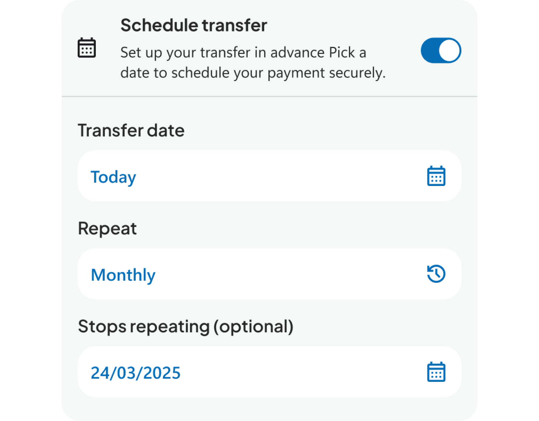
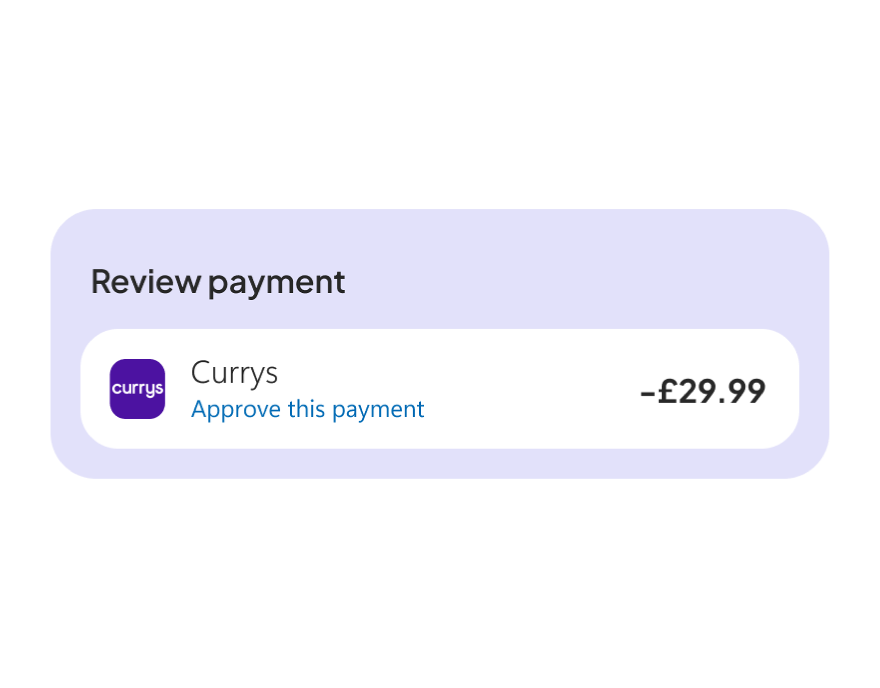
Understanding how users move through complex, high pressure journeys and making those experiences feel clear and reliable. This Faster Payments flow is a strong example of that, where speed, accuracy, and trust are critical. I focused on breaking the process down into simple, structured steps that guide the user with confidence, reducing friction and making sure each action feels safe and intentional. The result is a flow that supports a core user need while staying fast, predictable, and easy to use.
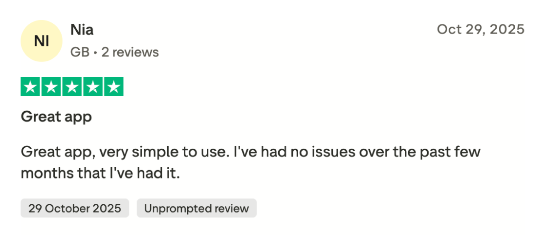
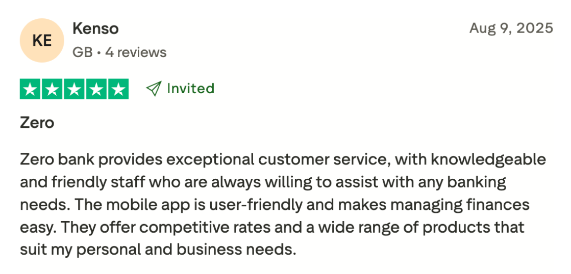
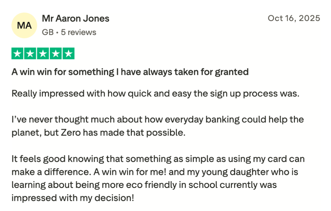
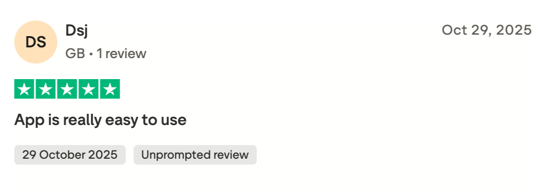
Customer feedback played an important role in validating product decisions and highlighting areas that resonated most with users. Reviews consistently praised the app's simplicity, ease of use, and overall experience, helping reinforce the value of a customer focused design approach.
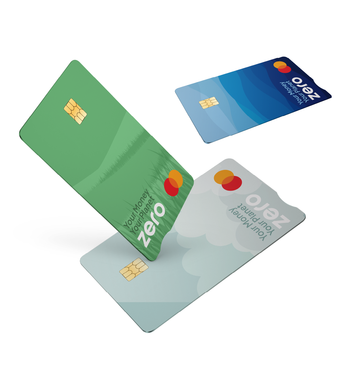
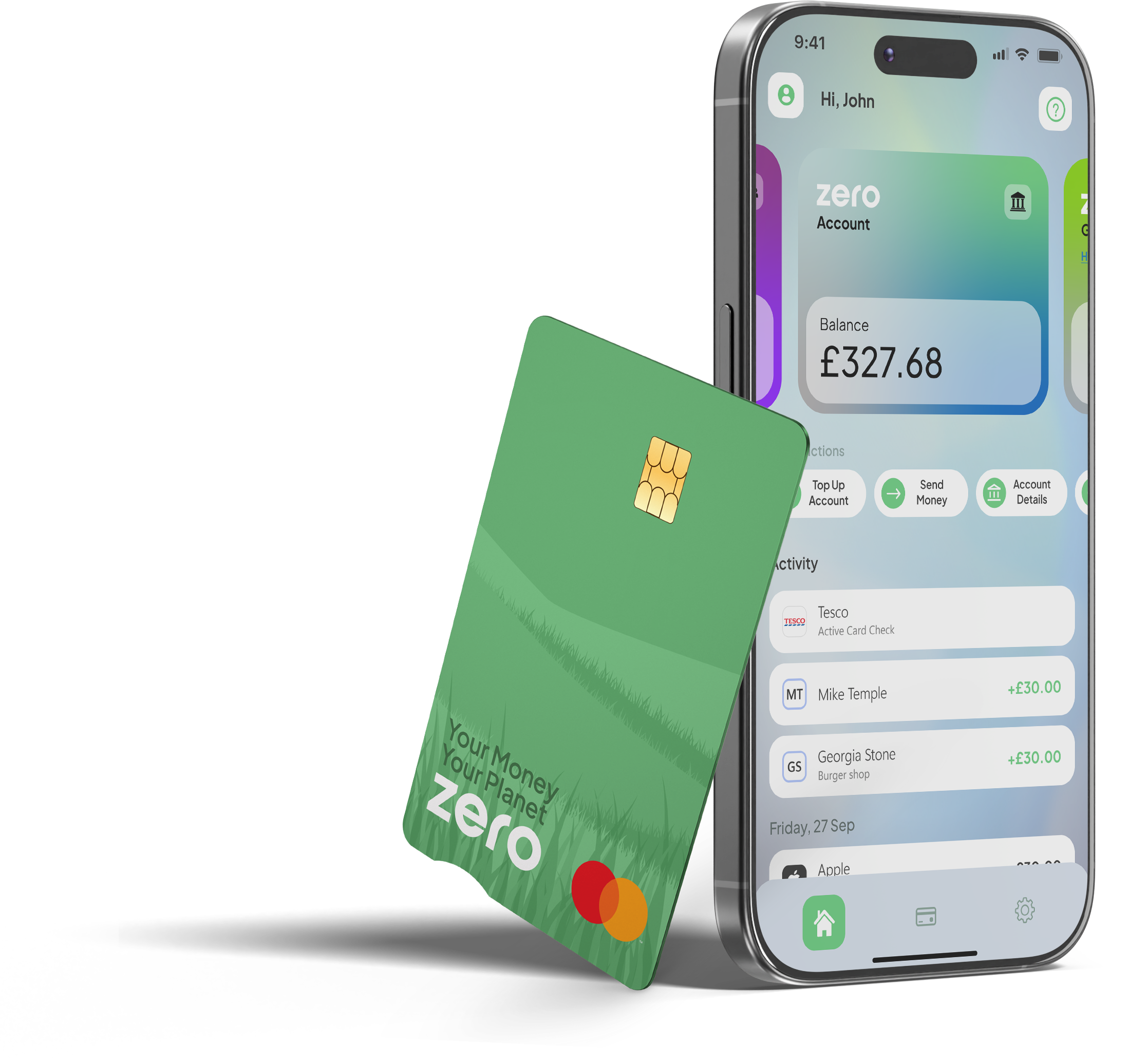
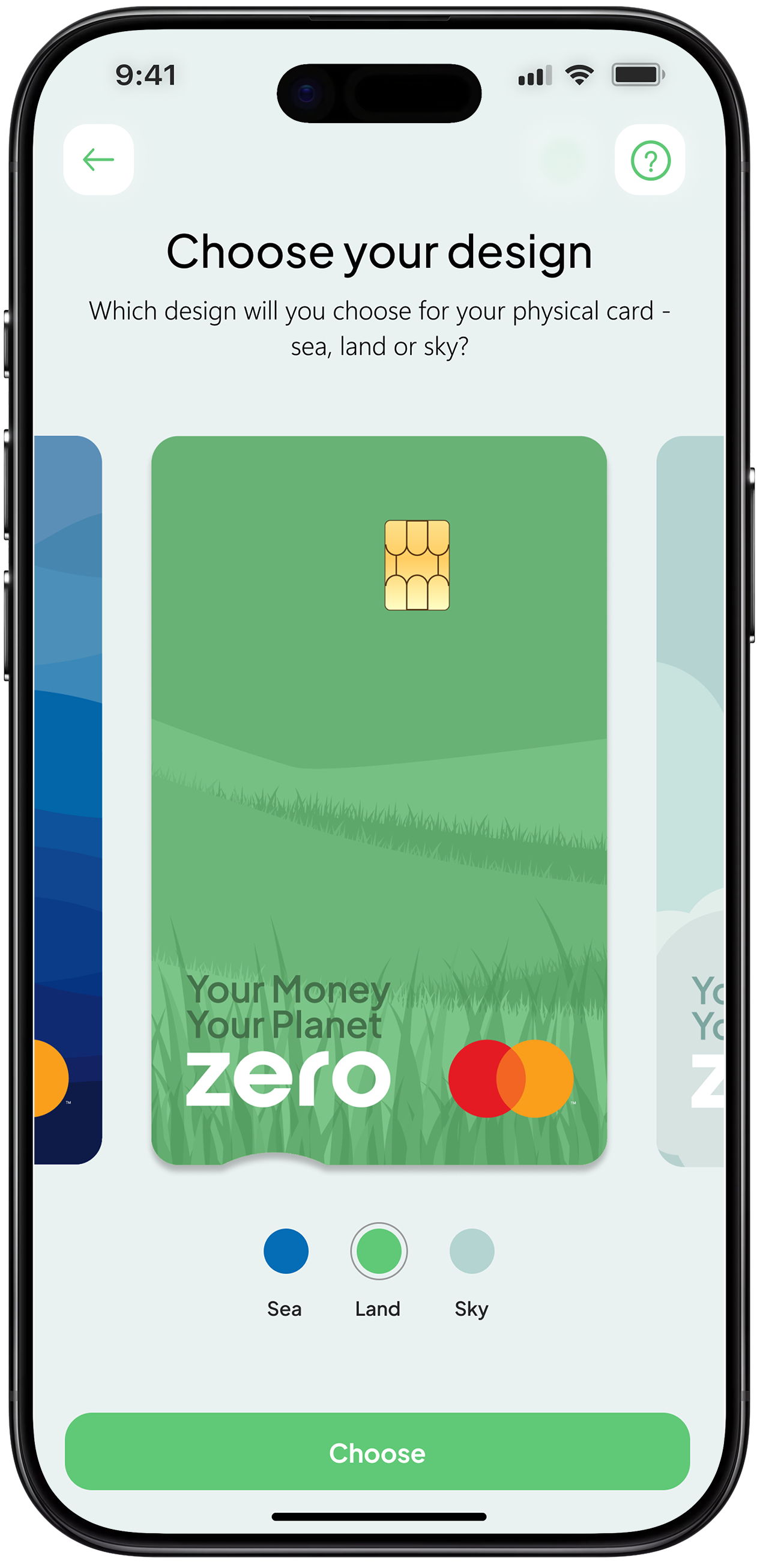
I focused on building trust through a clear and consistent visual identity that makes the product feel credible from the first interaction. In a space where users are naturally cautious, the goal was to create a calm, confident experience that feels reliable across every touchpoint. This extended beyond the interface into designing the debit cards and supporting marketing materials, ensuring the brand feels considered wherever users engage with it.
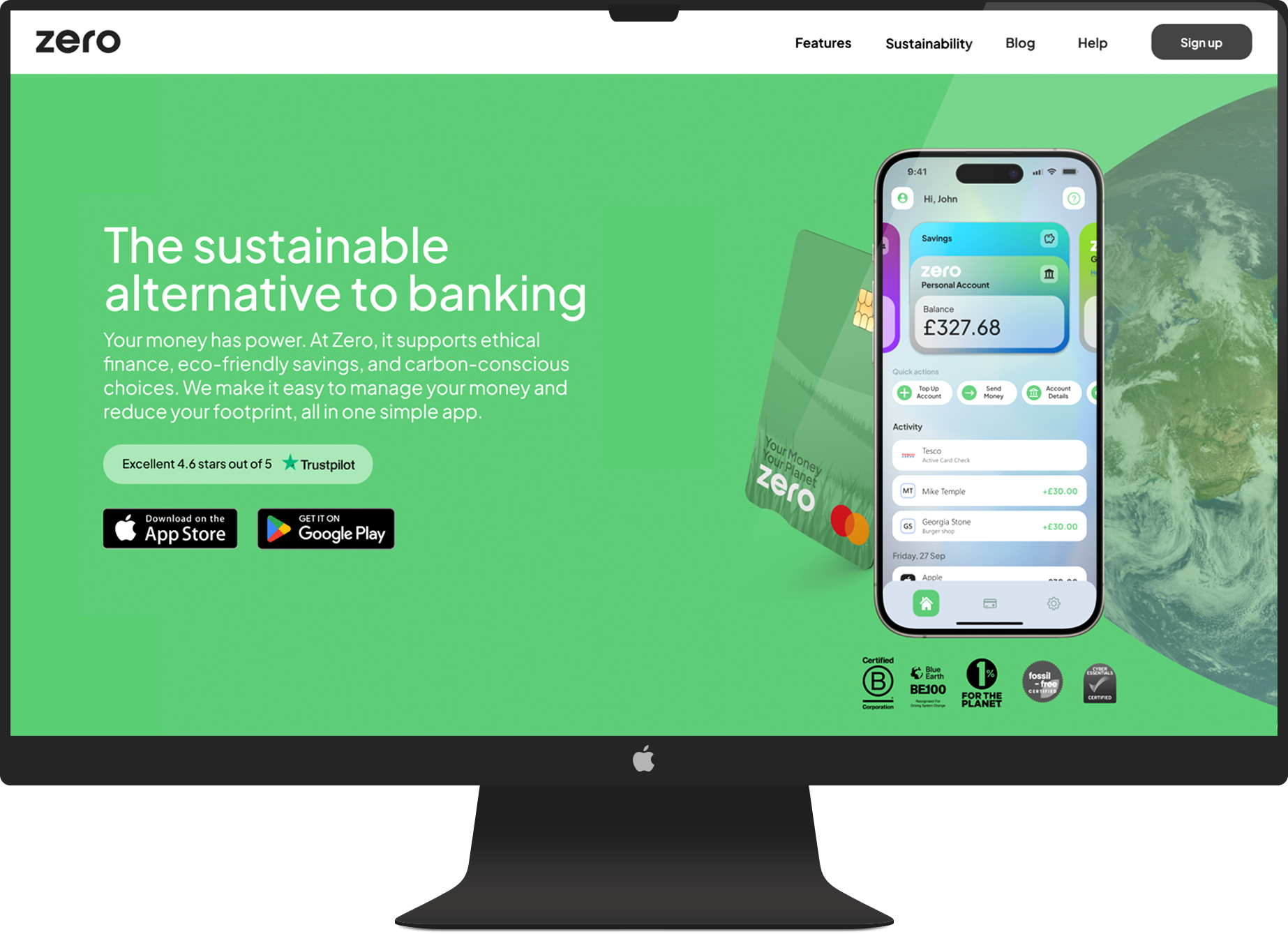
I developed a cohesive system across the app, website, and physical assets so everything feels aligned and intentional. The website was also recognised by HubSpot as one of the top fintech designs to take inspiration from, ranking #4 (just below, Revolut, Wise, PayPal), blog.hubspot.com/website/30-financial-website-designs-to-inspire-you, which reflects the strength of the overall direction. Showing both digital and physical outputs highlights how the brand carries through the full experience, helping the product feel more established and trustworthy from day one.
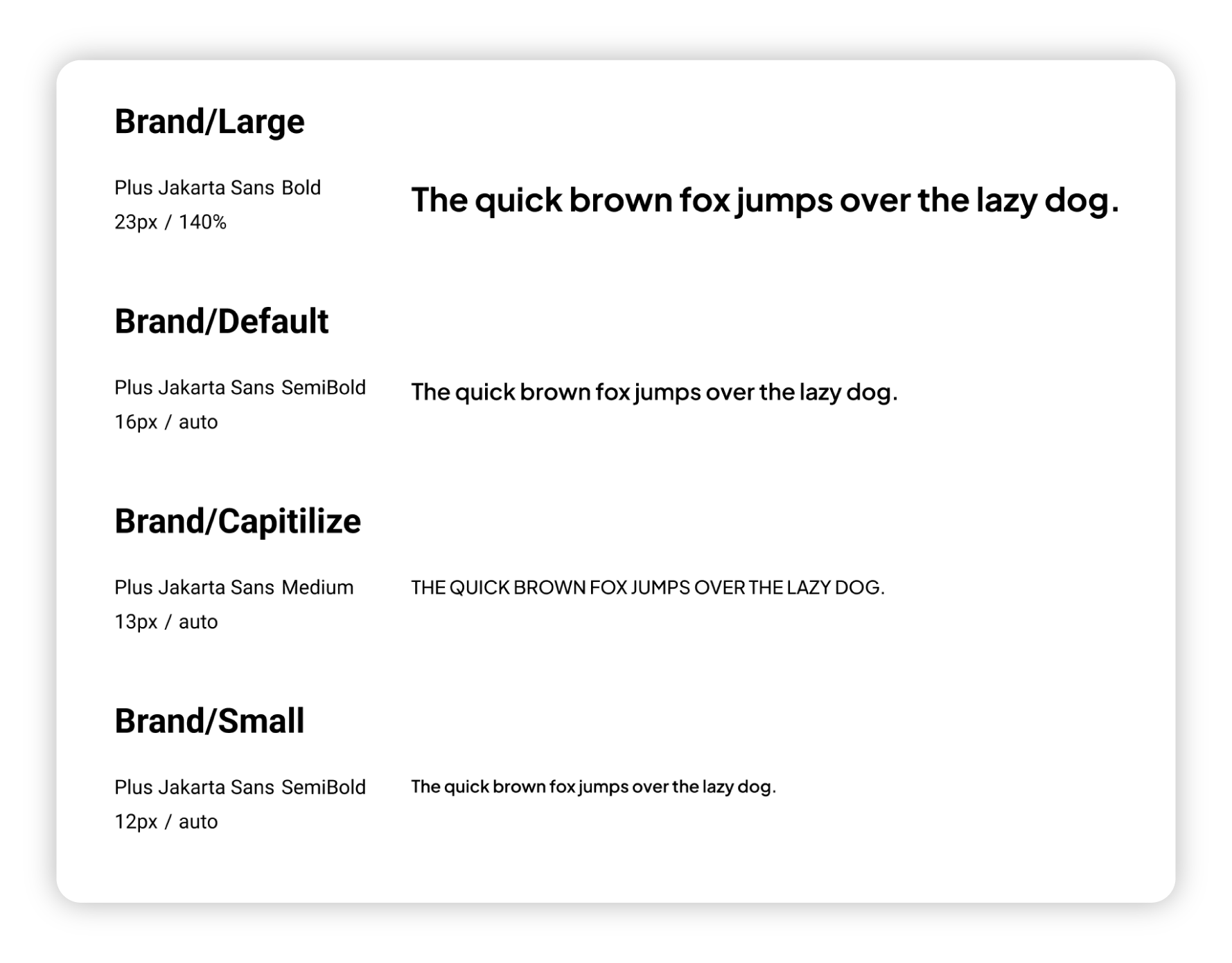
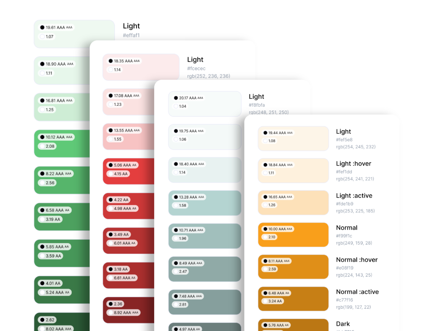
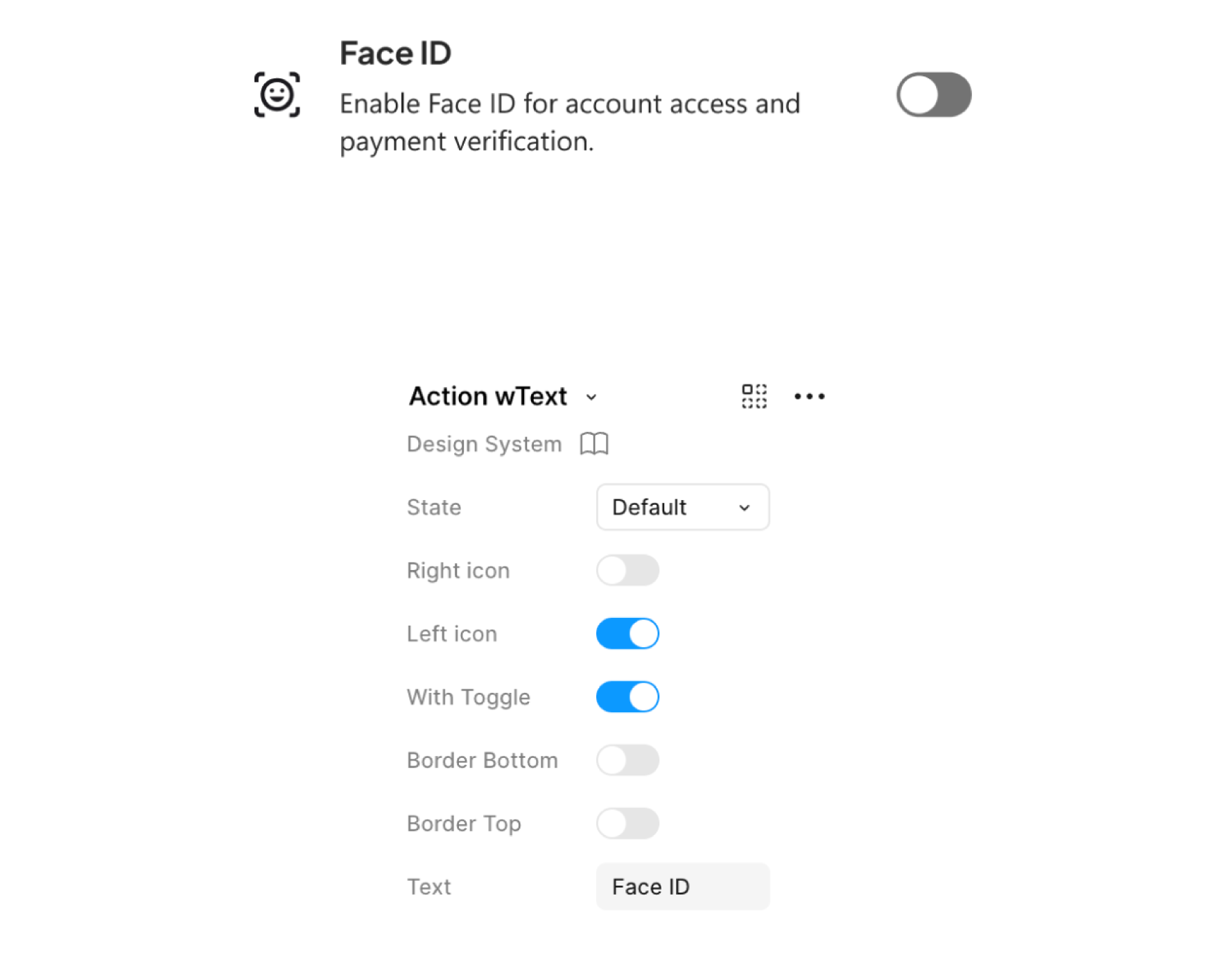
I designed and maintained Zero's design system to create consistency across the product while supporting rapid feature development. Built using atomic design principles, the system included reusable components, custom iconography, typography standards, grid structures, and interaction patterns tailored specifically to the brand.
It became the foundation for both design and development, helping teams deliver experiences that felt cohesive, scalable, and recognisably Zero.
Atomic design
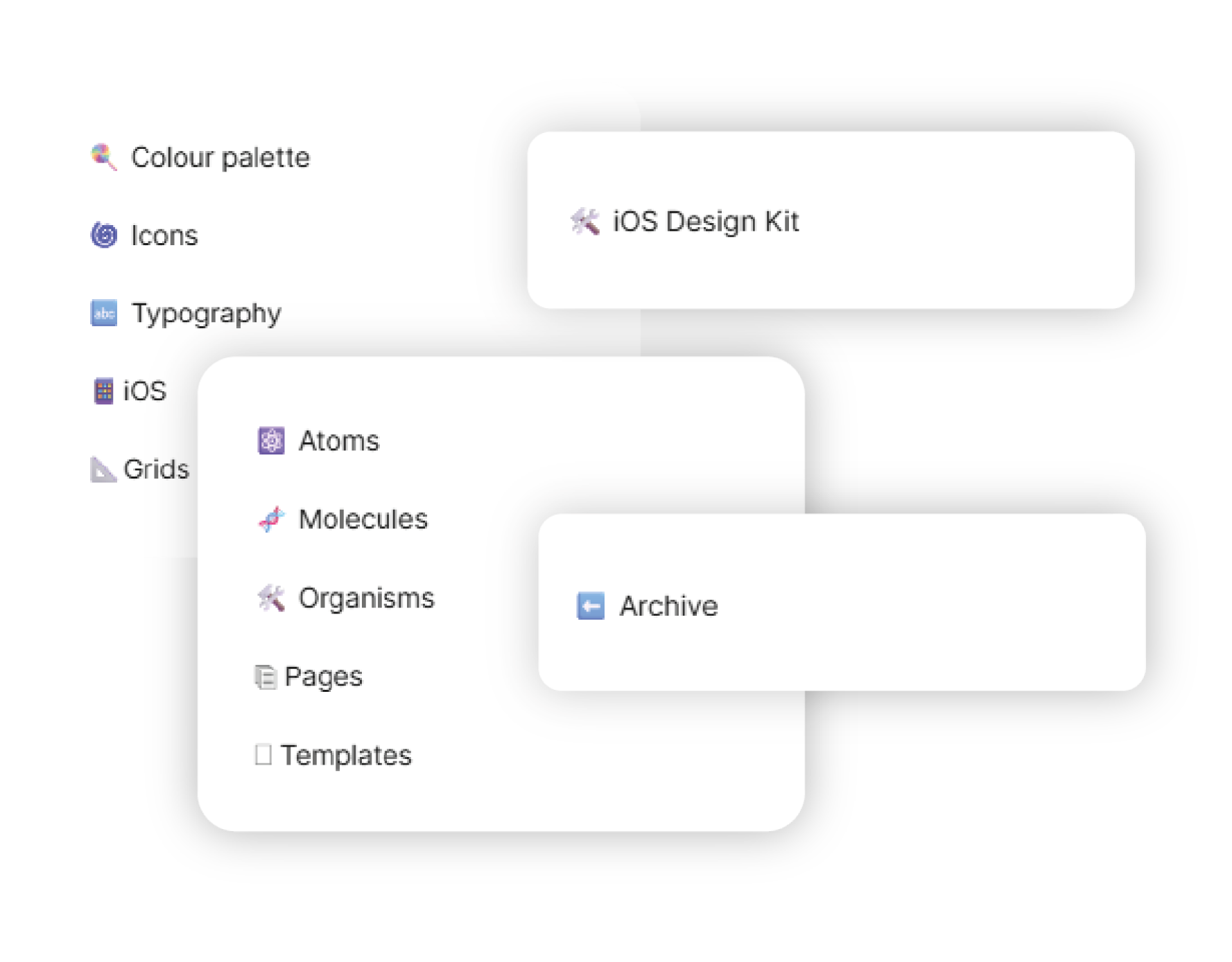
Visual hierarchy
Atoms
Organisms
Molecules
Pages + templates
Text patterns
Colour-pallete
Interaction
Interaction
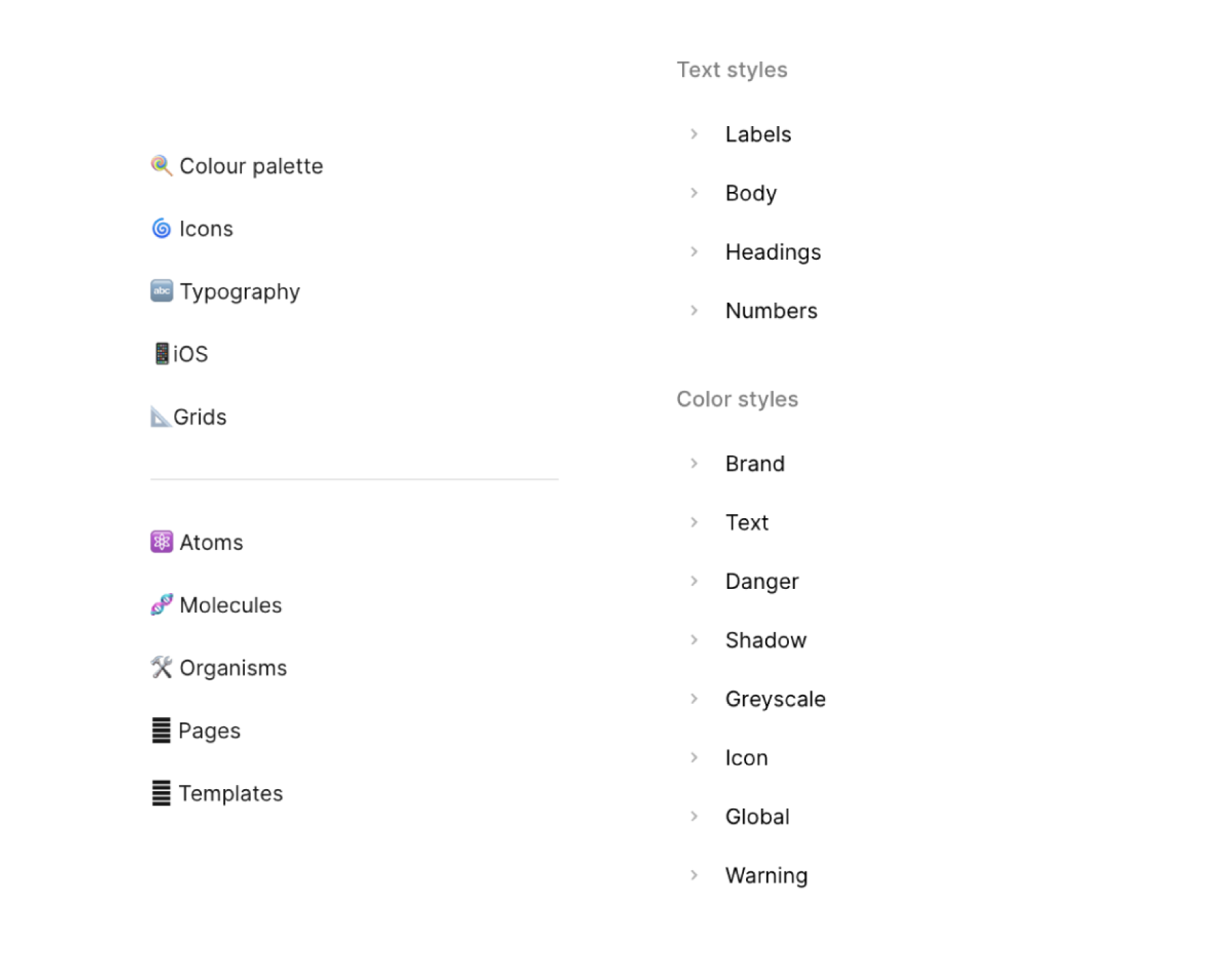
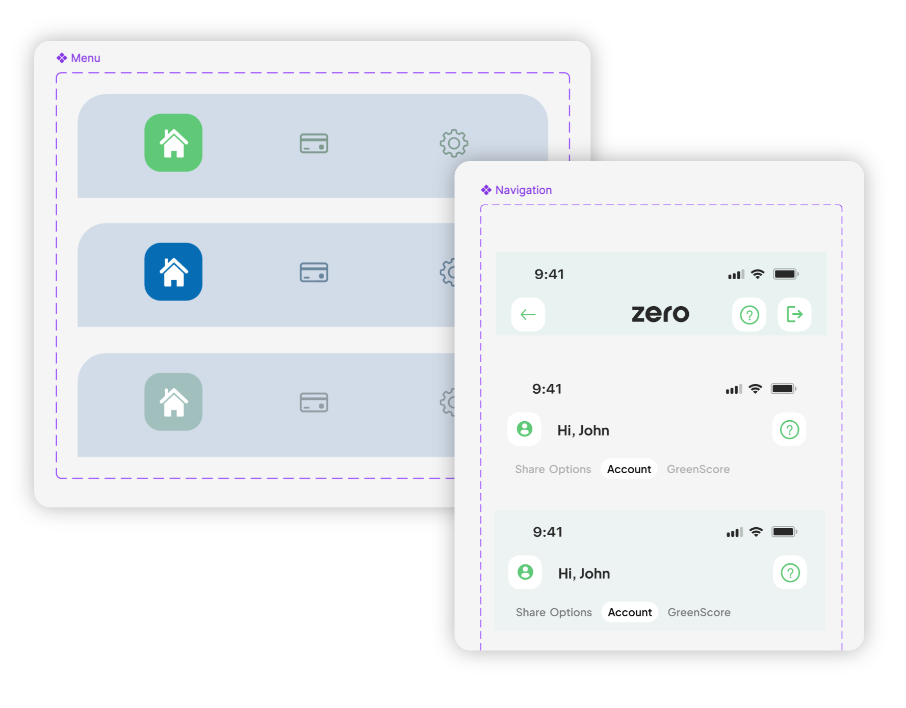
While external UI kits were used to accelerate early exploration, the majority of the visual language was custom built. Component styling, colour systems, gradients, iconography, borders, and visual hierarchy were carefully crafted to create a distinctive identity that felt both modern and trustworthy. Every design decision was made with consistency in mind, ensuring the product maintained a recognisable look and feel as new features were introduced.
To ensure consistency beyond the UI, I designed a range of custom graphics, illustrations, and supporting visual assets used throughout the product. Using ChatGPT, Adobe Photoshop, and Adobe Illustrator, I rapidly explored concepts and transformed them into production ready artwork that aligned with the wider design system. This helped create a more cohesive experience while strengthening Zero's visual identity.
Building Zero required close collaboration with a range of external partners, payment providers, and technology platforms. From navigating platform guidelines and compliance requirements to integrating third party services and APIs
I worked closely with stakeholders to translate technical constraints into cohesive user experiences. This ensured new features aligned with both business objectives and the wider design system while maintaining a seamless experience for customers.

Worked closely with platform guidelines and documentation to design payment experiences that met Apple and Google requirements.

Collaborated with Onfido to design identity verification journeys that aligned with their onboarding requirements while maintaining a consistent Zero experience. Careful consideration was given to user trust, completion rates, and reducing friction during account setup.

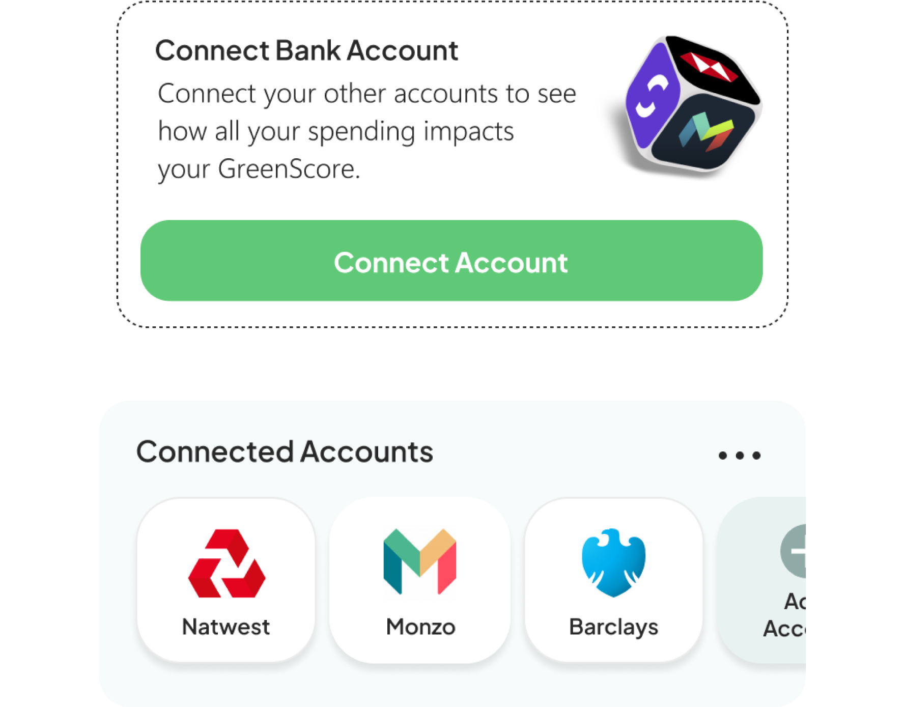
Designed experiences around Open Banking integrations, translating complex financial connections into simple and intuitive user journeys. This required balancing technical capabilities with customer understanding to create accessible and trustworthy features.

Worked within Mastercard's design requirements to create debit card experiences that aligned with both brand standards and Zero's visual identity. Particular attention was given to hierarchy, compliance, and maintaining consistency across physical and digital touchpoints.

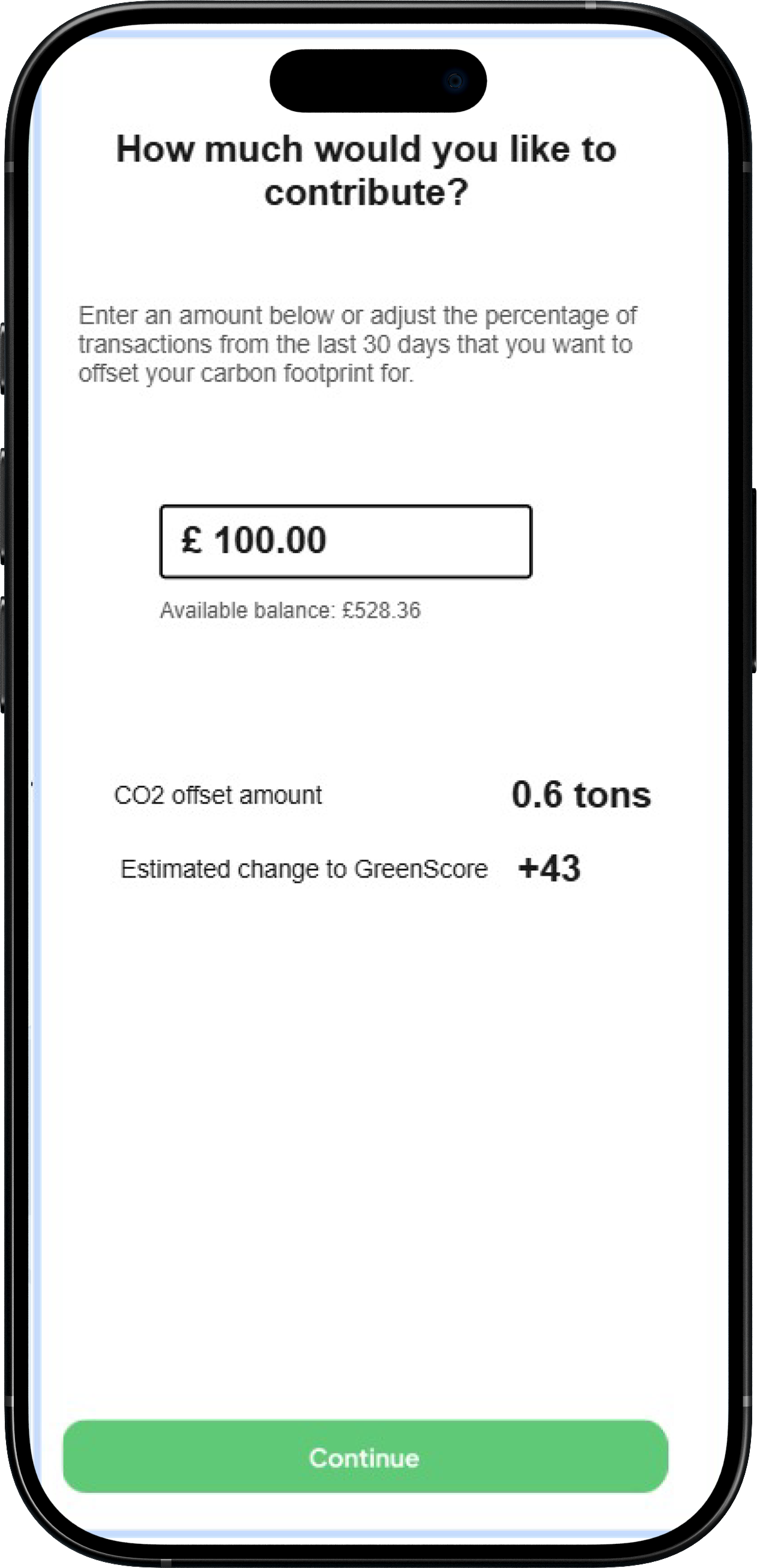
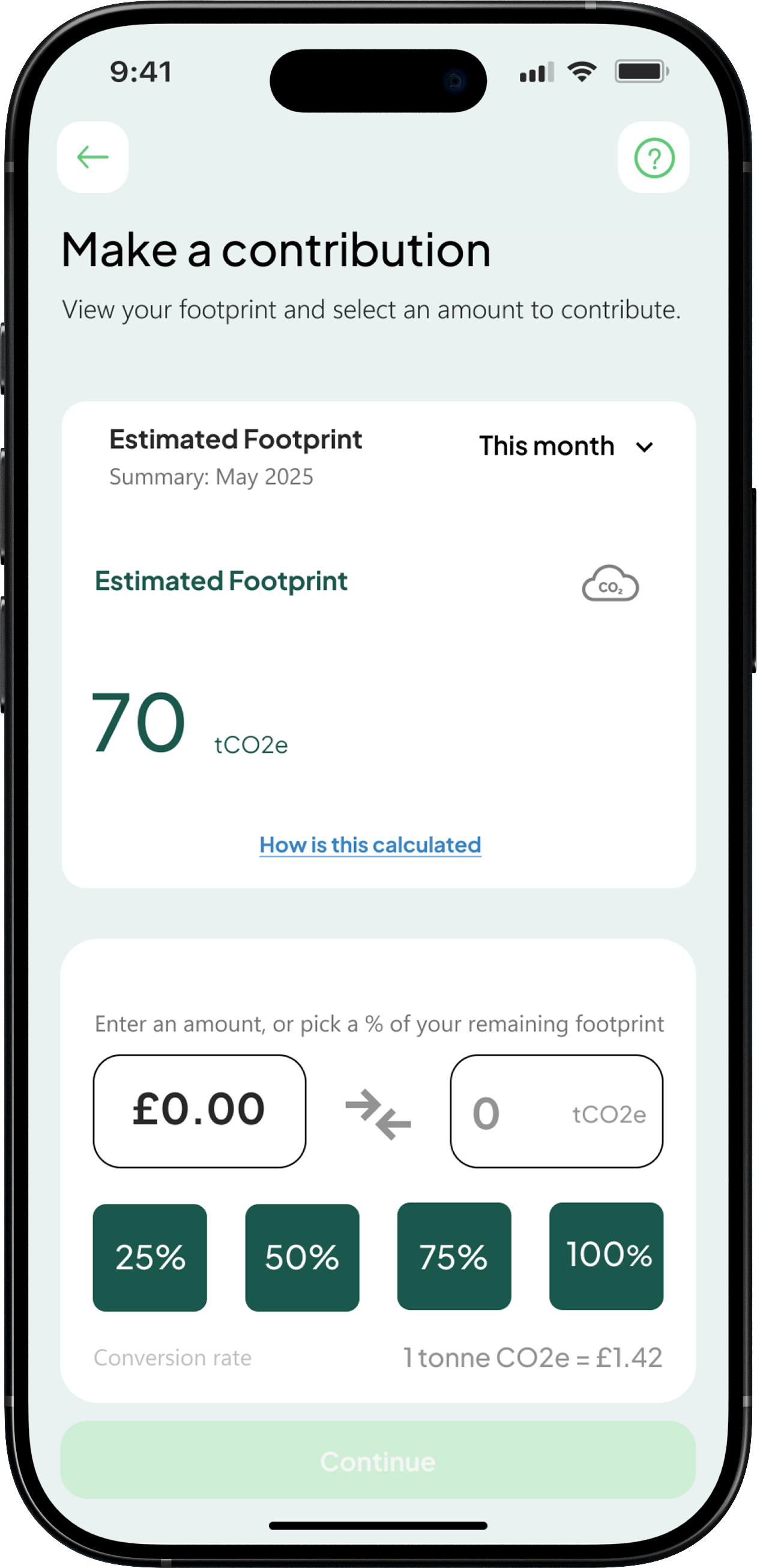
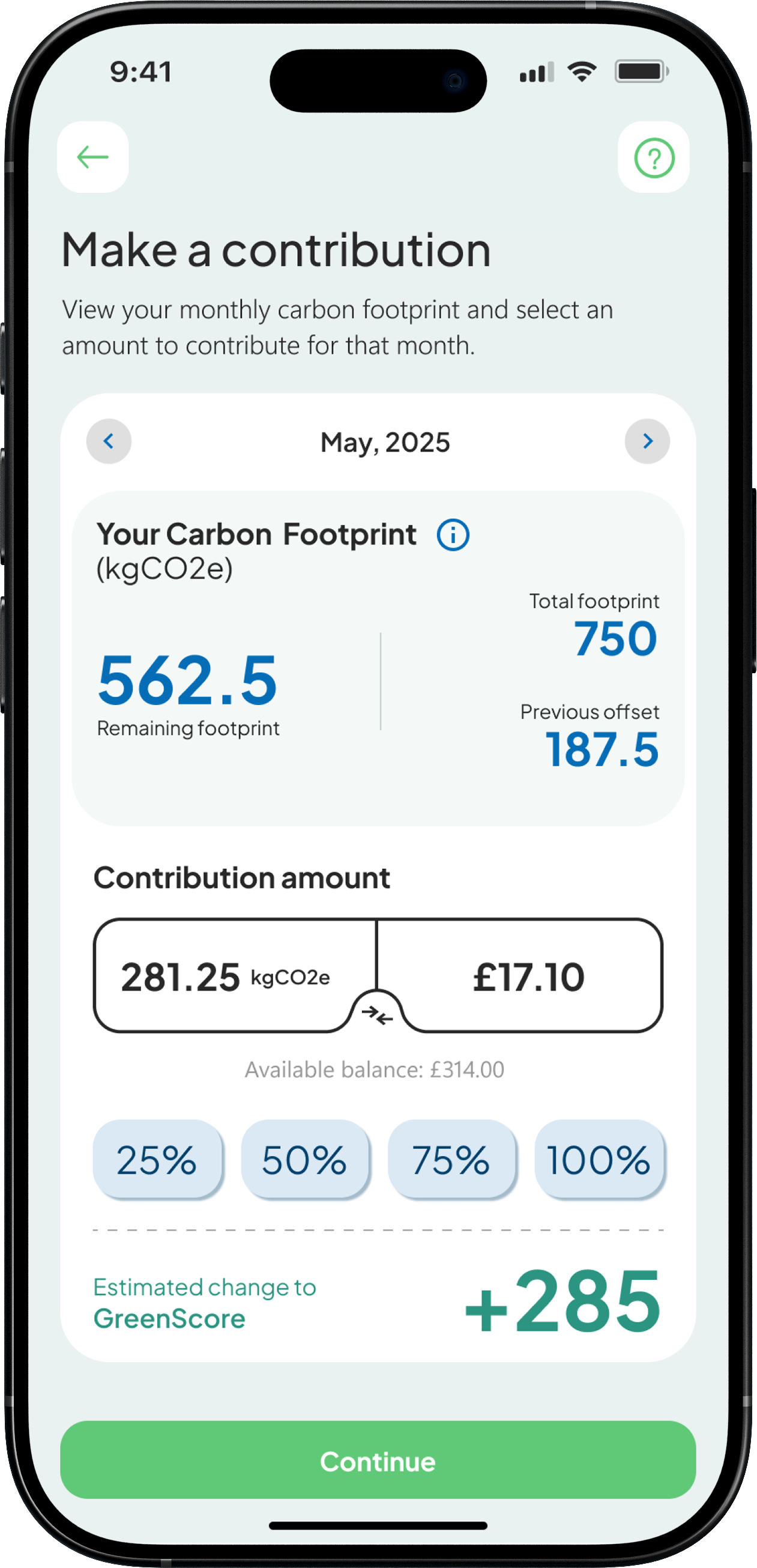
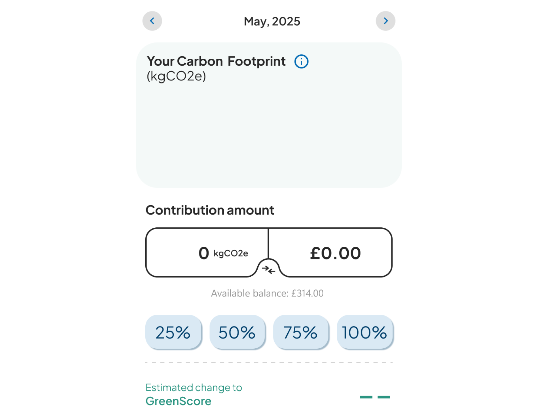
Partnered with Lune to support the development of Zero's carbon offsetting feature. Using provided APIs, JSON data, imagery, and documentation, I designed an experience that integrated seamlessly with the product while remaining aligned with the wider design system.