Figma

PropTech
Product Designer
100+
Screens Designed
15+
Products Improved
200+
Local authorities
8+
User Interviews
Screens Designed
Products Improved
Local authorities
User Interviews
At Aareon, I worked as the sole Product Designer within a cross functional team of product managers and developers, responsible for improving and modernising software used by housing associations, local authorities, and contractors across the UK. My role covered the full product lifecycle, from research and discovery through to prototyping, stakeholder alignment, and delivery. Working across multiple products including Management Studio, Repairs Management, Contractor Forms, and Aareon Connect, I redesigned complex workflows, improved existing functionality, strengthened the design system, and helped shape future product direction through user centred design.
The Aareon ecosystem consisted of multiple products serving different users, workflows, and operational needs across the housing sector. While each platform solved a unique business problem, they shared a common challenge: modernising legacy experiences without disrupting critical day to day operations.
Rather than pursuing large scale redesigns, I focused on incremental improvements that reduced friction, improved visual hierarchy, modernised components, and created a more consistent experience across the 3 main products.
A customer and housing management platform used by housing providers to manage tenant records, customer interactions, operational workflows, and day to day service delivery.
A platform supporting repair scheduling, work order management, contractor workflows, and maintenance operations across housing organisations. My work focused on improving operational efficiency, modernising contractor forms, simplifying data capture, and creating clearer workflows for both office based teams and field operatives.
A low code integration platform enabling housing providers to build automated workflows between systems and services. Inspired by modern automation tools such as Microsoft Power Automate, the platform allowed users to create triggers, actions, and integrations through an intuitive workflow builder without requiring extensive technical knowledge.
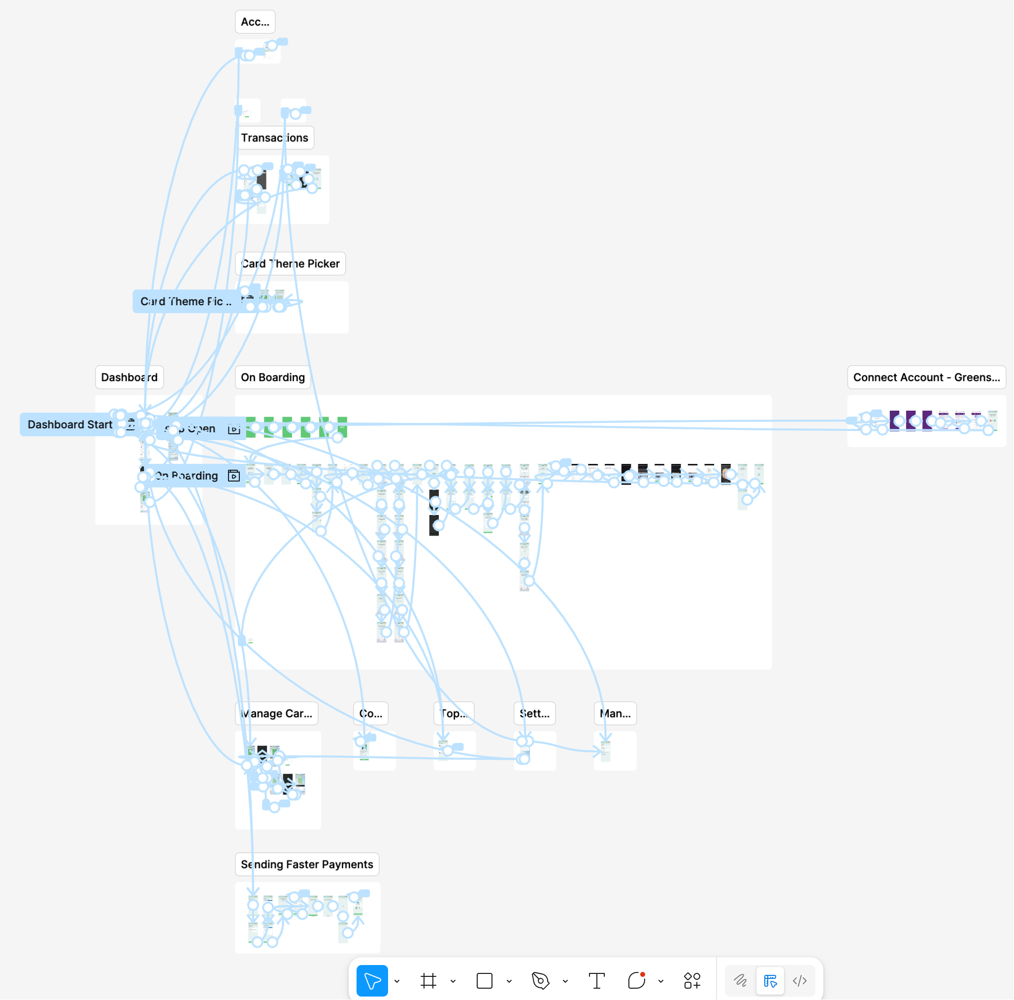
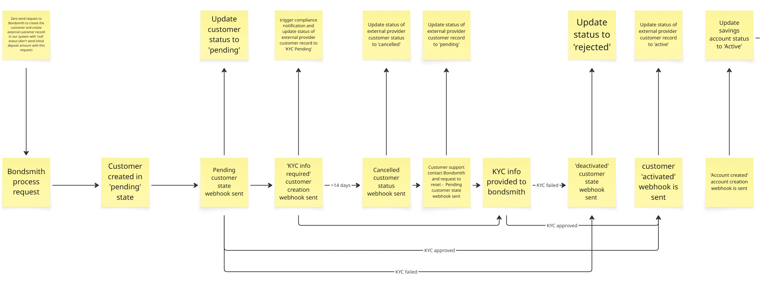
In most scenarios, a linear workflow was not enough. Interactions involving KYC, external providers, and changing customer states required mapping multiple outcomes rather than a single path. This reinforced that product design is not always clear cut, requiring adaptability to real-world constraints while still delivering a clear and consistent user experience.
Research findings were translated into actionable design
decisions that were tested through prototypes and
stakeholder reviews before development began. Project
requirements were typically introduced through product
documentation, discovery workshops, or weekly planning
sessions with Product Owners, with the level of detail
varying depending on the initiative. This flexible
approach allowed solutions to be shaped collaboratively
while reducing delivery risk and creating confidence in
future product direction.
Project Scope Example PDF
Wireframe
Low fidelity
High fidelity
I used Figma prototypes to test flows and interactions, helping identify friction early and refine the experience before development. These prototypes were also used to align stakeholders and support early funding discussions.
Moving from wireframes to high fidelity designs allowed ideas to be explored, tested, and refined before implementation.
Early concepts focused on information architecture and workflow validation, while later stages introduced interaction detail, accessibility improvements, and visual consistency.
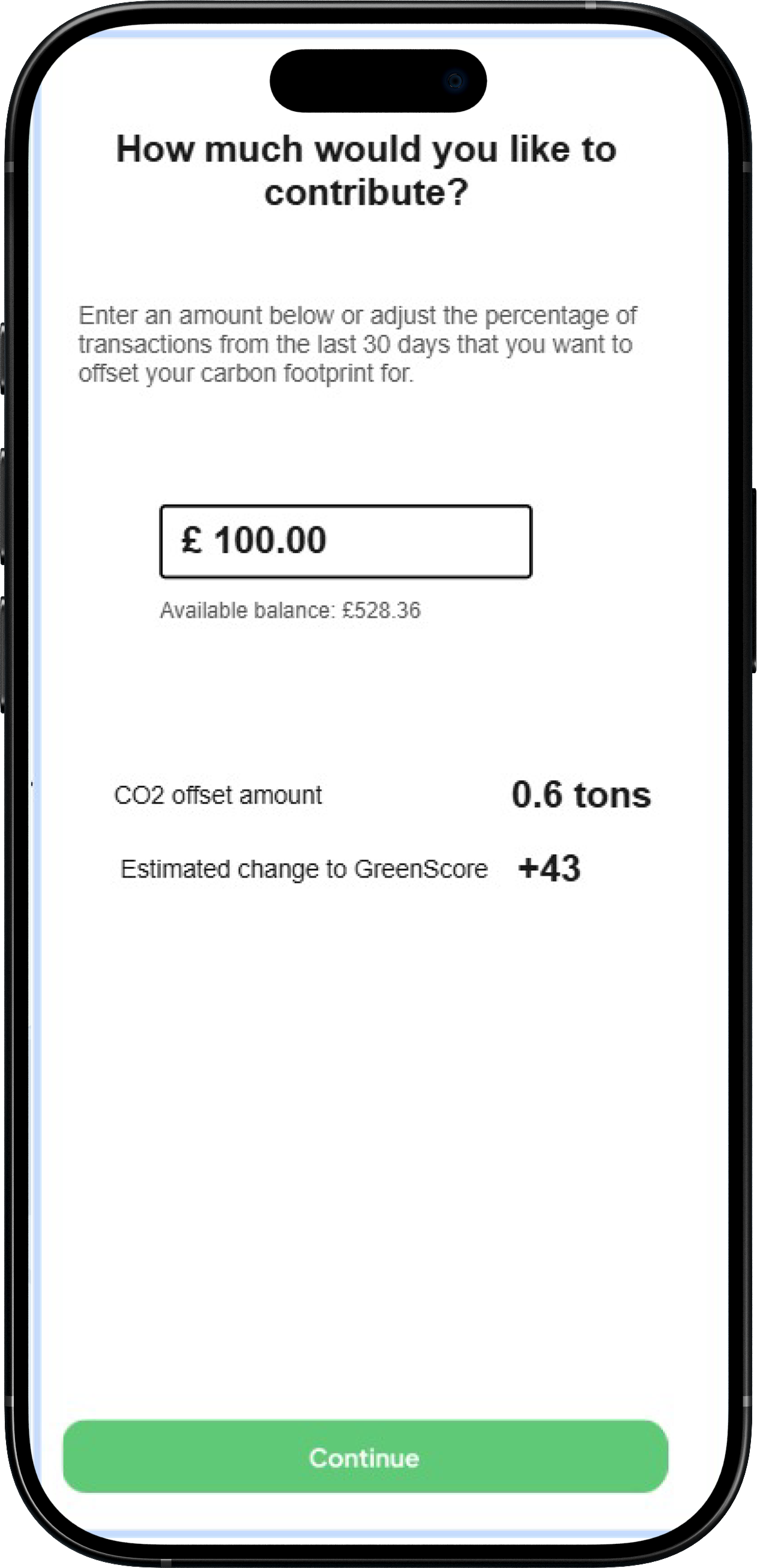
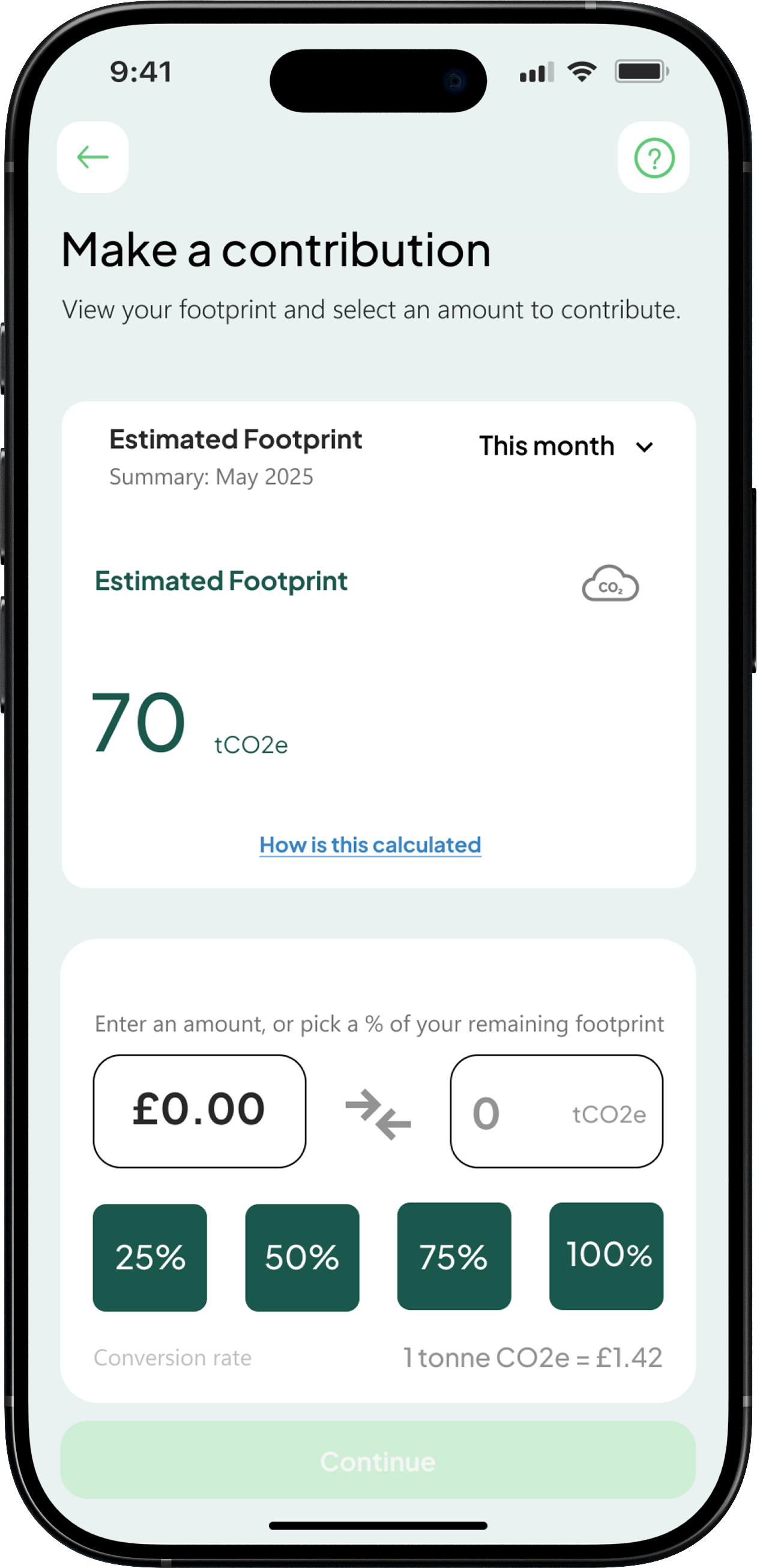
Dashboard
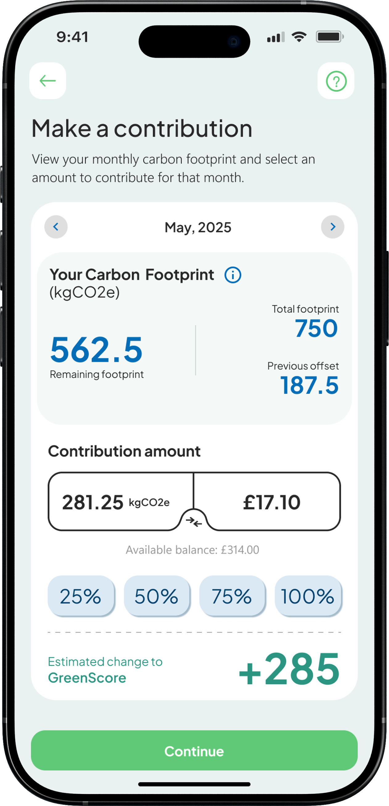
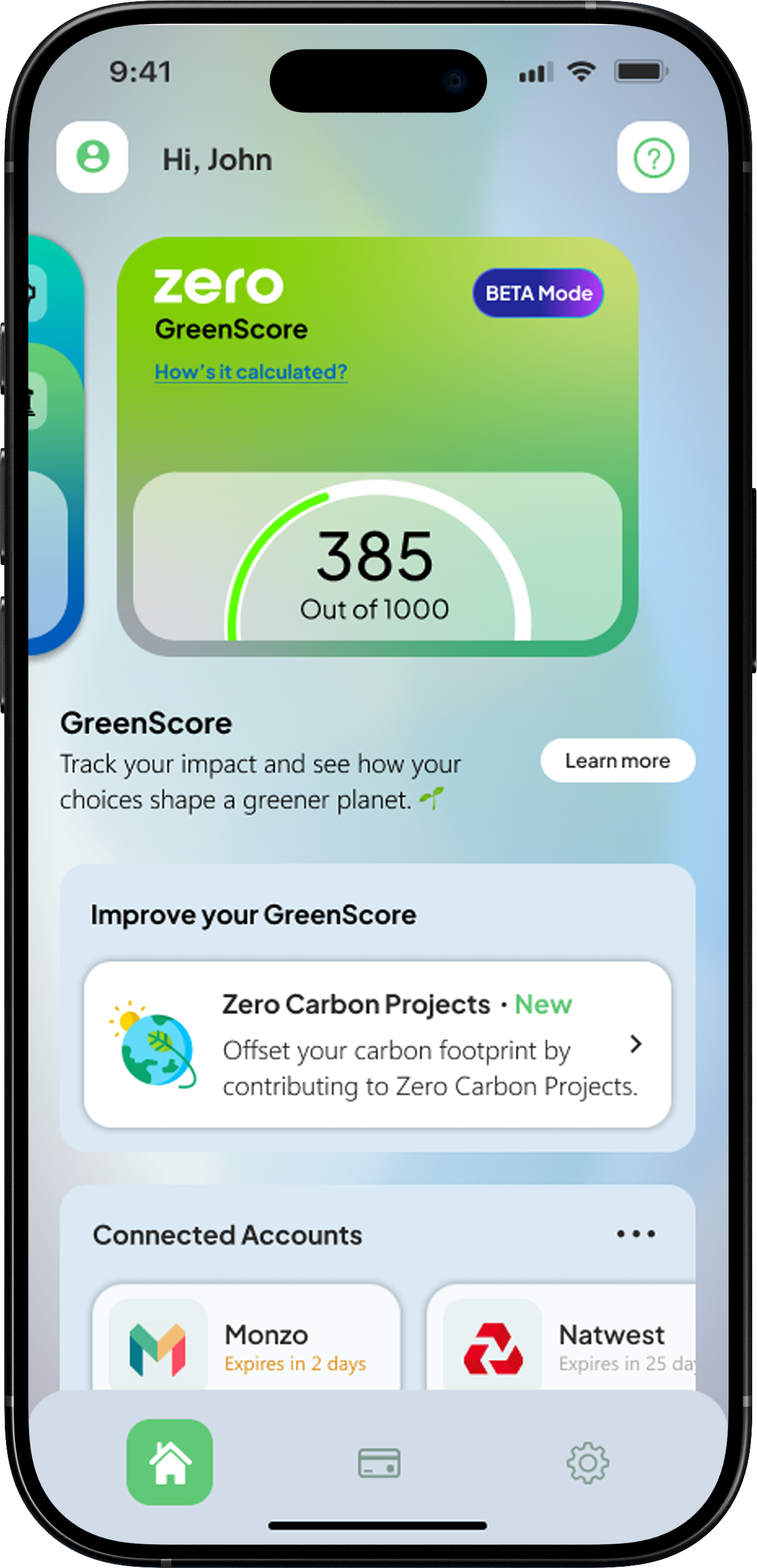
GreenScore
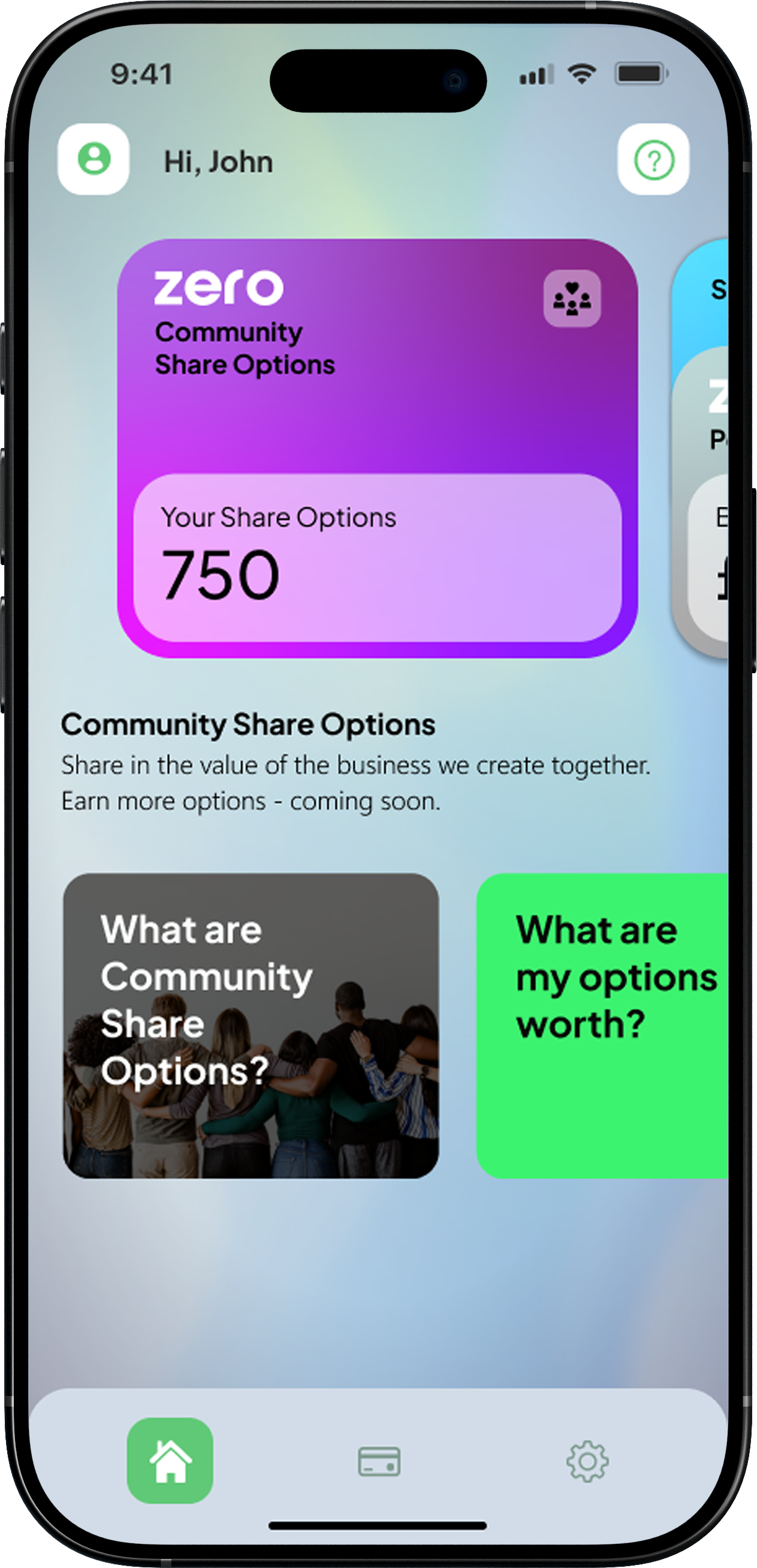
Community options
Carbon offsetting
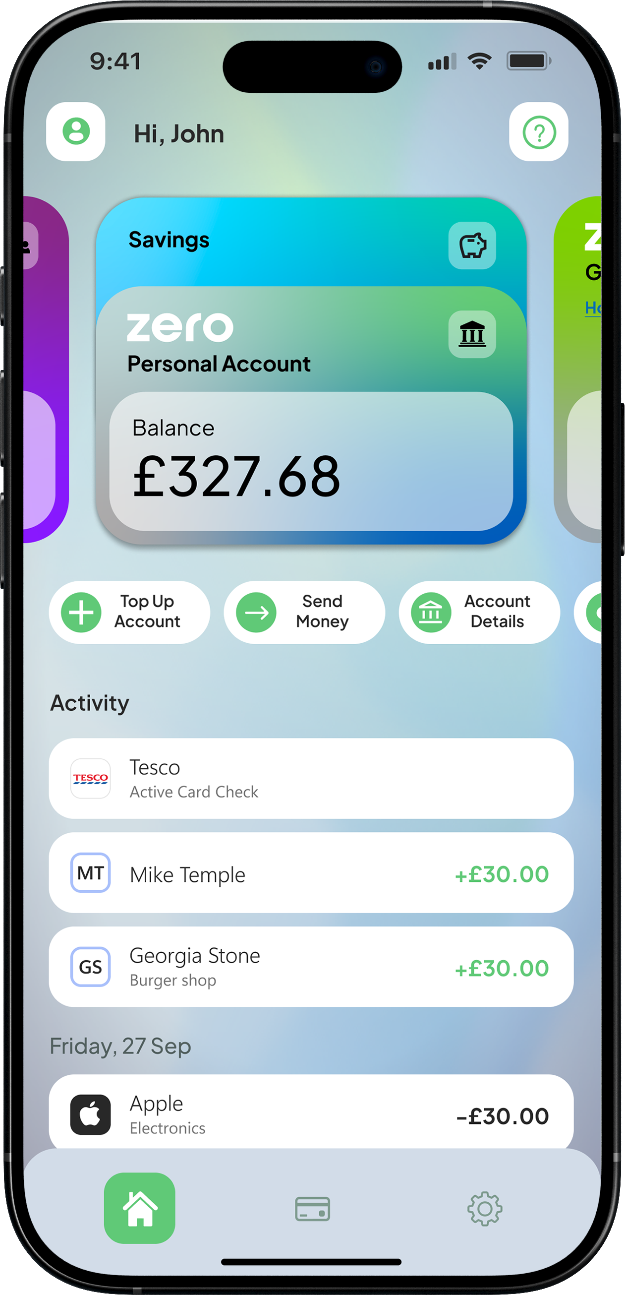
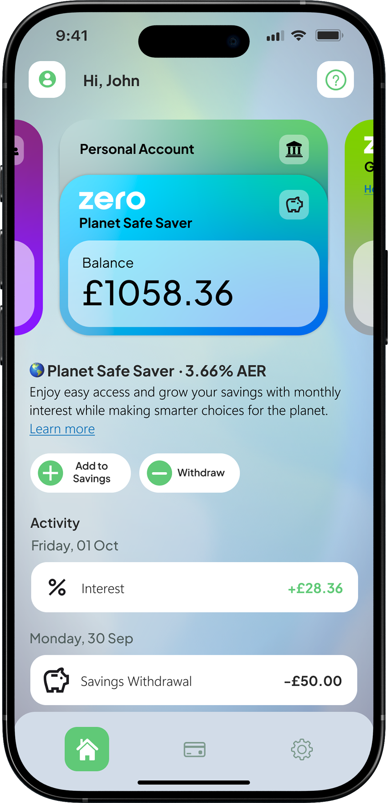
Savings
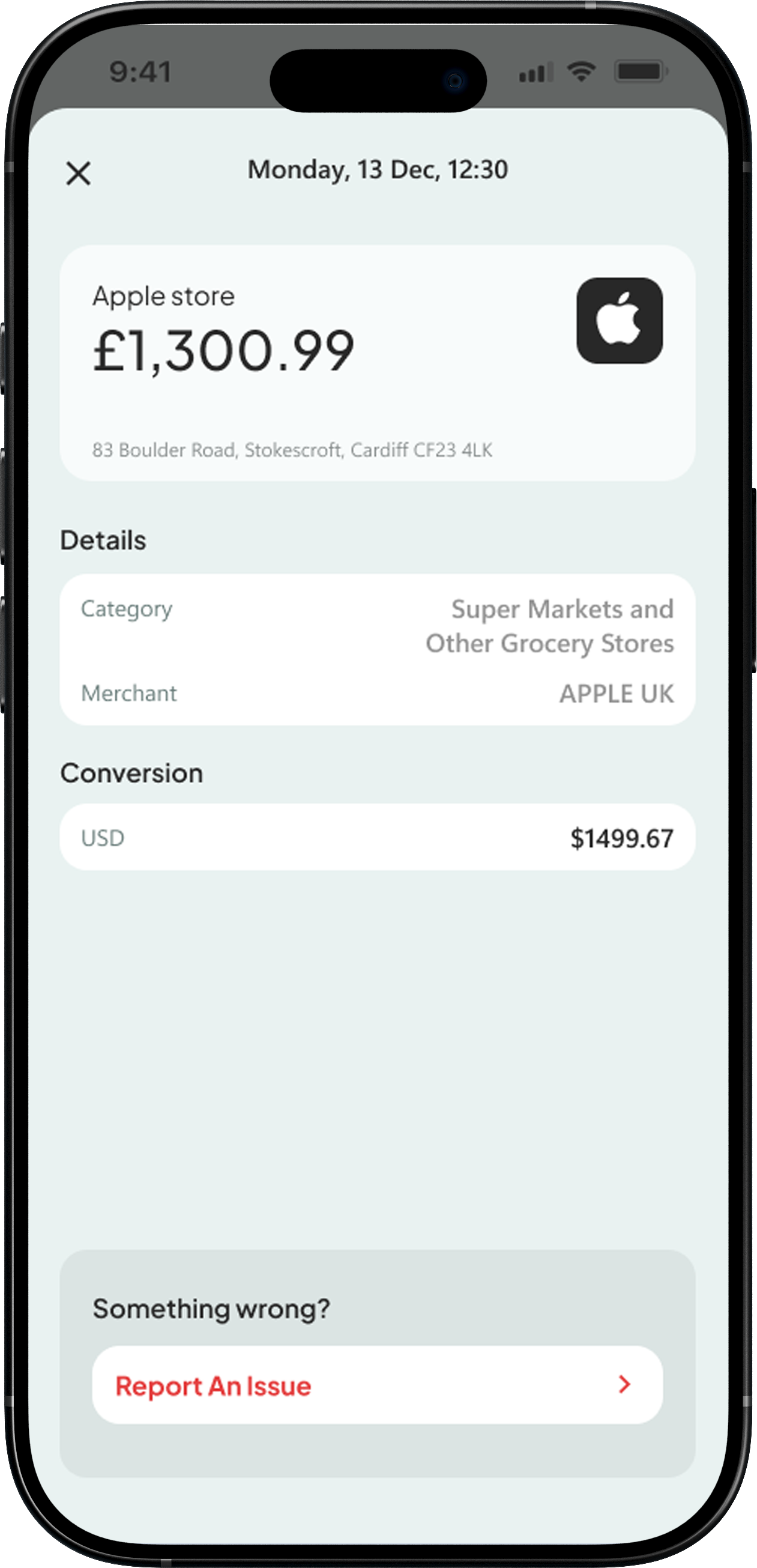
Transaction
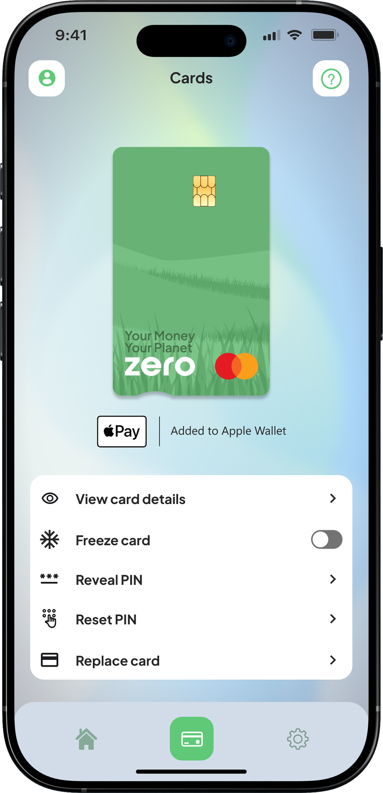
Card
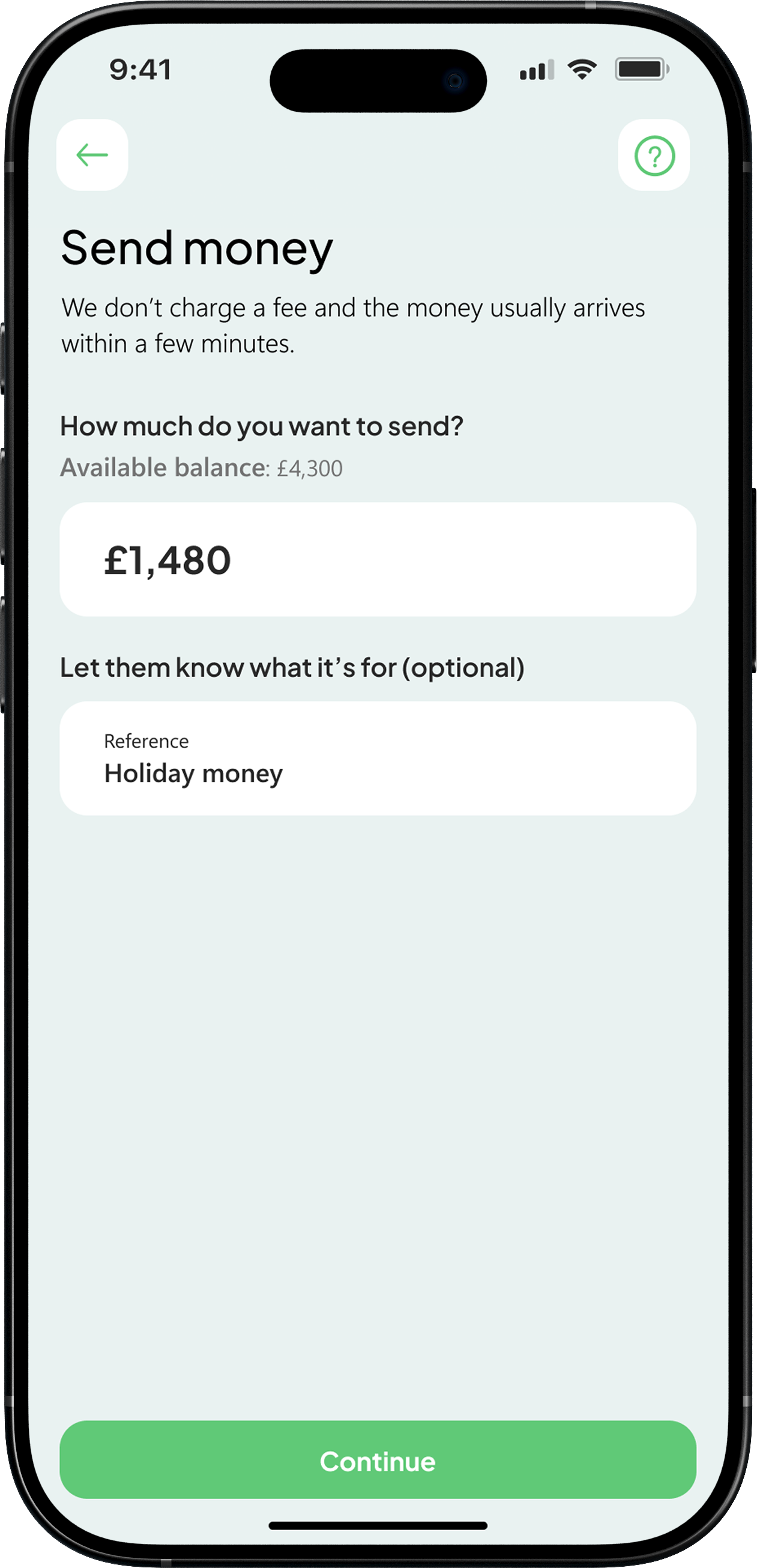
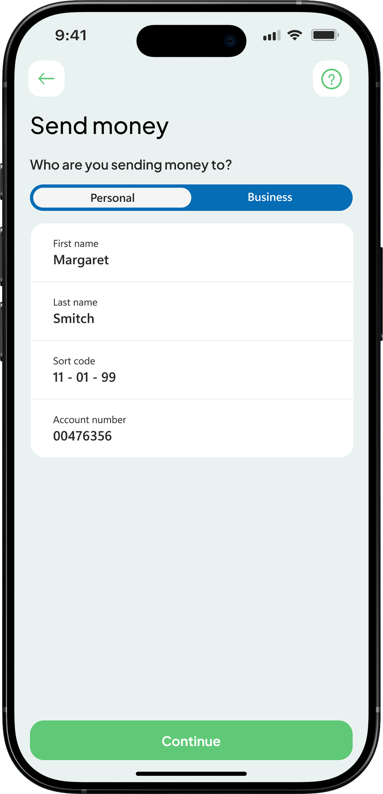
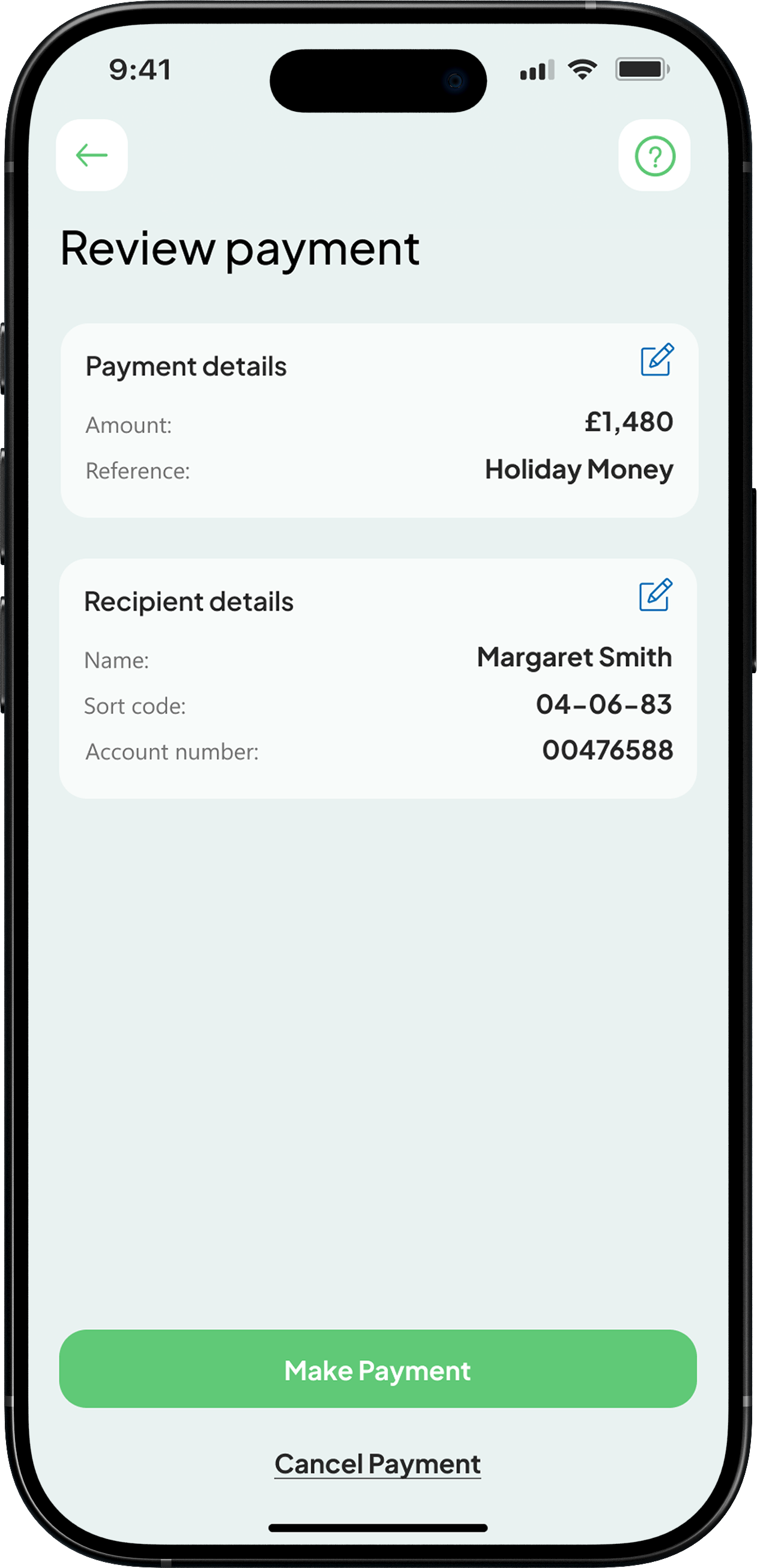
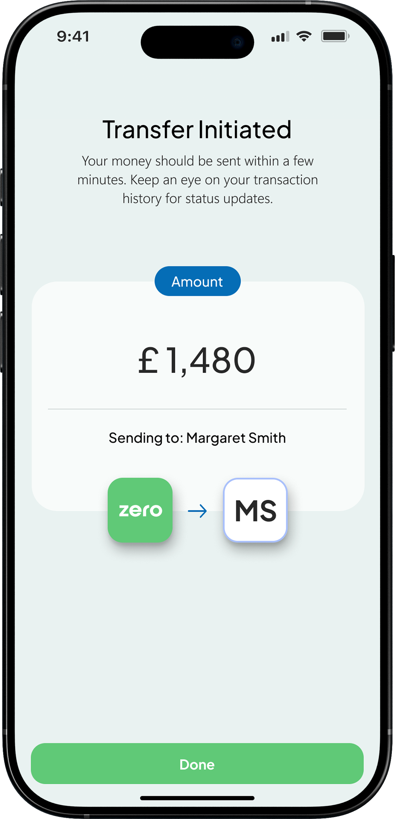
Understanding how users move through complex, high pressure journeys and making those experiences feel clear and reliable. This Faster Payments flow is a strong example of that, where speed, accuracy, and trust are critical. I focused on breaking the process down into simple, structured steps that guide the user with confidence, reducing friction and making sure each action feels safe and intentional. The result is a flow that supports a core user need while staying fast, predictable, and easy to use.
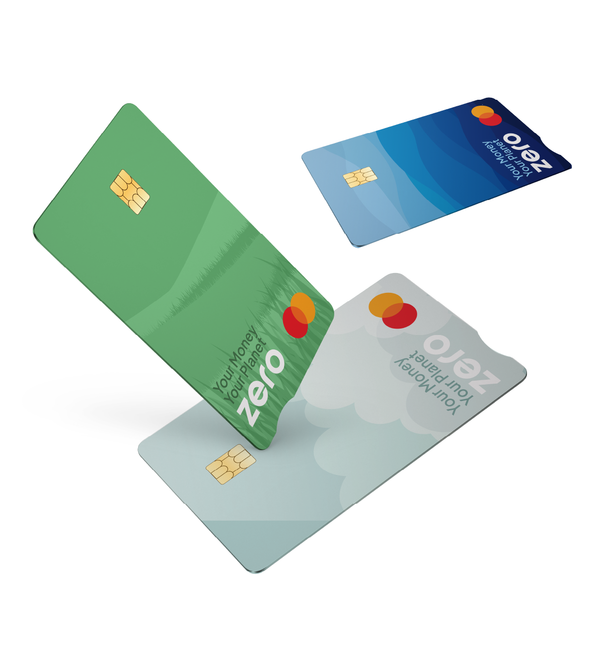
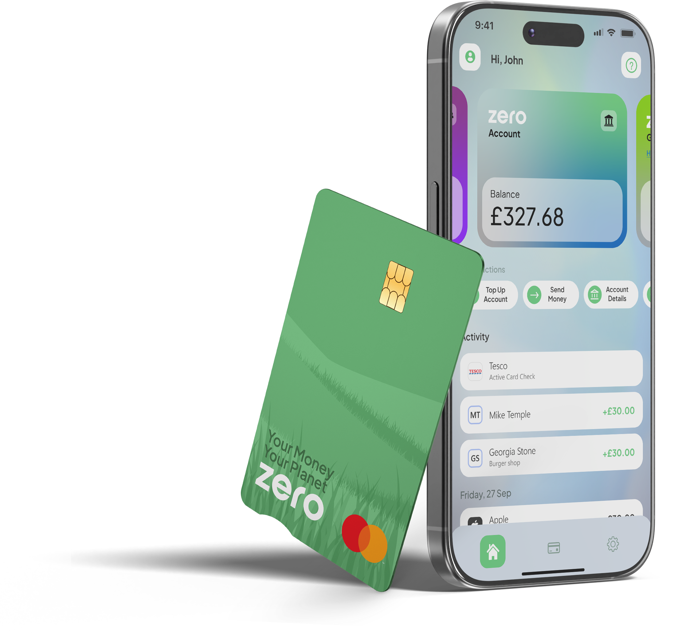
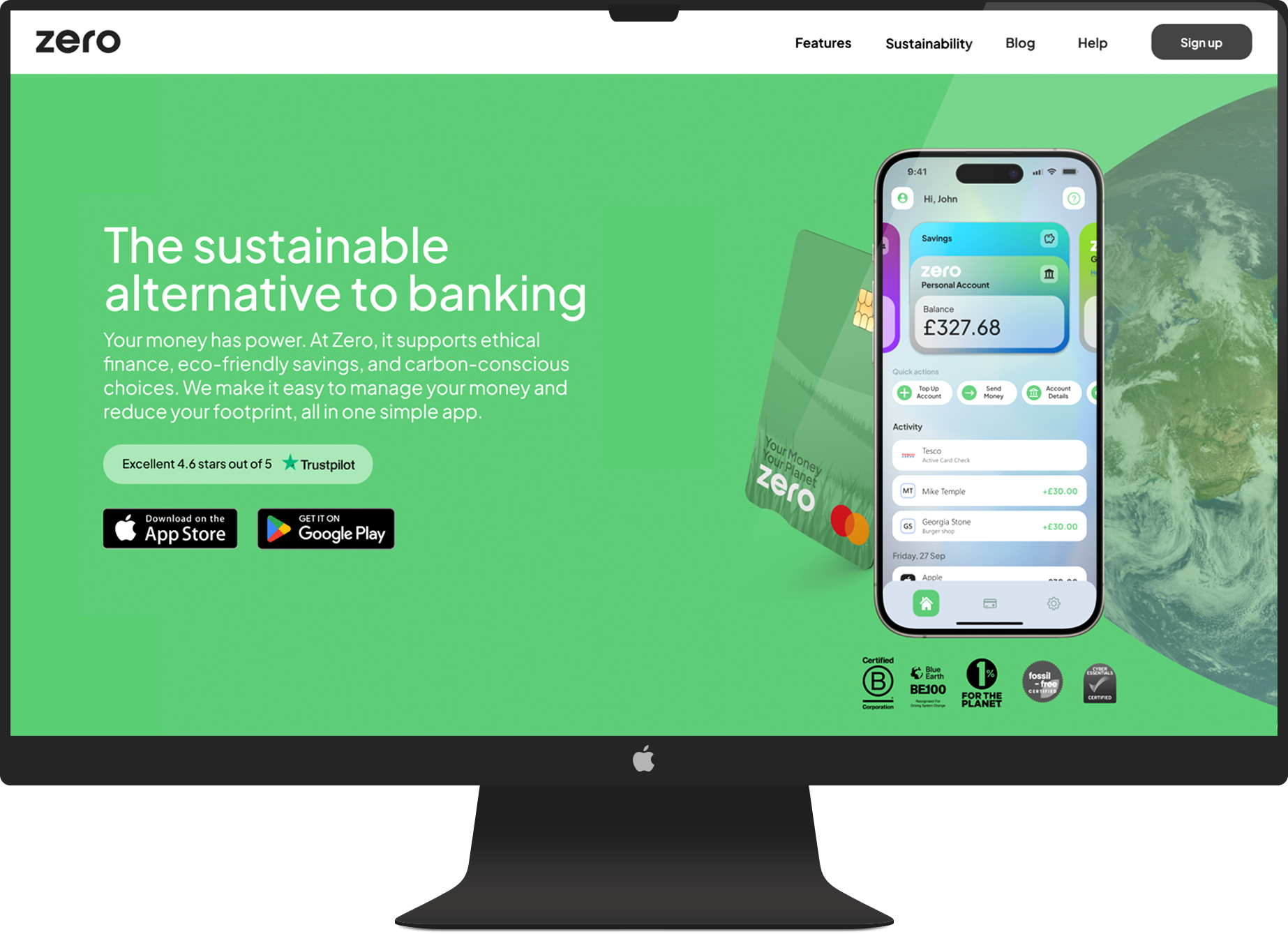
I focused on building trust through a clear and consistent visual identity that makes the product feel credible from the first interaction. In a space where users are naturally cautious, the goal was to create a calm, confident experience that feels reliable across every touchpoint. This extended beyond the interface into designing the debit cards and supporting marketing materials, ensuring the brand feels considered wherever users engage with it.
I developed a cohesive system across the app, website, and physical assets so everything feels aligned and intentional. The website was also recognised by HubSpot as one of the top fintech designs to take inspiration from, ranking #4,blog.hubspot.com/website/30-financial-website-designs-to-inspire-you, which reflects the strength of the overall direction. Showing both digital and physical outputs highlights how the brand carries through the full experience, helping the product feel more established and trustworthy from day one.
In more complex scenarios, a linear journey was not enough. Interactions involving KYC, external providers, and changing customer states required mapping multiple outcomes rather than a single path. This reinforced that product design is not always clear cut, requiring adaptability to real-world constraints while still delivering a clear and consistent user experience.
I moved from low to high fidelity to take ideas from rough concepts through to production. Wireframes let me quickly map out flows and structure, while high fidelity designs refined the detail, interactions, and usability. This kept things moving fast early on, while making sure the final experience was solid and ready to build.
Wireframe
Low fidelity
High fidelity
I used Figma prototypes to test flows and interactions, helping identify friction early and refine the experience before development. These prototypes were also used to align stakeholders and support early funding discussions.